

Arranging your products logically so that customers can browse your catalog and find what they're looking for is one of the most crucial aspects of developing a successful Shopify website. Even though it only takes a few minutes, creating product collections can have a significant positive impact on your online store.
Continue reading to learn everything you need to know about using Shopify collections, as well as some amazing collection page examples.
What Is A Shopify Collection
Shopify collections are groupings of products you can set up to make it easier for your customers to browse all products within a certain category. A fashion retailer might set up a selection of men's shirts, for instance. A collection of lamps might be arranged in a Shopify store for home décor.
Additionally, you can create collections of products that are all on sale or collections of seasonal products, such as summer essentials. You can provide a list of all your collections to your clients so they can quickly find the products they're looking for and begin browsing. Setting up an "all products" collection on Shopify is an additional choice.
Every item in your catalog is included when you create a Shopify all-products collection, enabling your customers to browse the entire inventory if they choose to do so (and if you want to allow it). If you have a small product catalog, listing all the items in a collection like this is a good idea.
Importance Of A Collection Page
Consider your online store a true brick-and-mortar store to get a sense of the significance of Shopify collections. Products are rarely dispersed and haphazardly arranged when a customer enters a typical store. Instead, the area of the store with women's clothing, office furniture, or (everyone's favorite) the sale rack is simple to locate.
Using a Shopify collection list, you can organize your online store similarly, saving your customers time and making it simple for you to direct them to the items they need.
Who Should Use Shopify Collections?
Every merchant can benefit from Shopify collections, but when you have a large product catalog, it is especially crucial to use collections correctly. For instance, a beauty retailer might stock thousands of items in their store, including eyeshadows in a range of shades, lipstick in a hundred different hues, and powder foundation in every shade imaginable.
It can be challenging for your customers to find what they're looking for if these thousands of products aren't organized into straightforward collections. They might even give up in frustration and choose to do business with one of your rivals.
Every Shopify merchant can use collections pages to not only organize their products but also control how each customer browses through their store. Adding products to collections is simple on Shopify, and it's a great way to arrange your product catalog so that it makes sense for both you and your customers. After creating your collections, you can consider how to feature them on your home page and which specific products you want to highlight or promote.
Types Of Shopify Collection
There are two main types of collections on Shopify:
Manual Collection
The products in manual collections are ones that you add on your own. This gives you much more control over the collection, but it also means that you'll have to add or remove products manually more frequently. For sporadic collections (such as flash sales), manual collections are a fantastic choice.
Automated Collections
Automated collections base product addition on selection criteria or "conditions" before adding them. Although the products are automatically added to the collection, you can control which requirements they must satisfy.
What Is The Difference Between A Collection And A Page On Shopify?
On Shopify, you can arrange your content into collections or pages. Before you begin building your online store, it's critical to comprehend how they differ because each has unique uses and advantages.
Your website's pages are its building blocks. Since they remain constant and static, you can use them to clearly and succinctly present your goods, services, or brand. Pages can be used to display static information about your business (like your shipping and/or returns policies) or to create landing pages for marketing campaigns.
You can group related products together in collections. If you sell clothing, for instance, you might have a collection for each season or various categories of clothing (like formal wear, casual wear, etc.). Collections help customers find what they're looking for on your website and are a great way to arrange your products for lookbooks or other marketing campaigns.
What distinguishes pages from collections, then?
Collections are dynamic and subject to regular updating, whereas pages are static and unchanging.
Pages work best for presenting information about goods, services, or brands in a clear and concise manner. Collections are excellent for assembling related products and helping customers quickly find what they're looking for on your website.

Build, test, and iterate on Shopify without the dev time
Replo has hundreds of templates to help you launch and test new landing pages - without writing a line of code.
How Do I Create A Collection Page On Shopify?
The steps to creating a collection page on spotify are as follows:
Step 1: Create A New Page Template
The creation of a new page template in Shopify is required in order to create multiple custom collections pages, and doing so is made significantly simpler by Shopify OS 2.0.
You must enter the page customizer to create the new page template. You can do this by going to Online Store Themes > Customize.
To view all page options for your store when you are in the customizer, click the drop-down menu at the top of the page.
Enter the template's name and the page on which to base it in the pop-up. Since this is a new template, the default template will serve as its foundation.
Step 2: Customize The Template
It's time to set up the new page template to list the collections you have decided to use. The first step is to add a new section to the page. We want to add the Collection List section, which includes a few additional elements on the page.
Click on one of the sidebar collection slots, choose "Add Collection," and then pick your desired collection from the list of collections to add.
After selecting the collection you want to see on the page, click Save, and Shopify will generate this template.
Step 3: Create A New Page
The template needs to be applied to a page now that it has been created. To do this, go to Online Store – Pages; Click on “Add” page.
You can choose the newly created template when creating a new page by selecting it from the drop-down menu next to the theme template on the right-hand side.
Once you've chosen the template, check that the page is set to be visible before saving it so that it will be live on your website. Then select the collections - all different watch models, as seen in the image above - that you want to see on the page.
Once you are happy with the collections you want to display on this page, click “Save” to create the new menu.
Step 4: Add Page To Main Menu
The last step is basically the same as the ones shown in the Show All Collections sections at the beginning of this post, but let's go through it again. Add a link to the new page in your main navigation menu.
Go to Online Store Navigation Main Menu. Add an item to the menu, but you want to look under Pages to find the page you made rather than selecting the Collections option from the menu that appears when you click the link box.
Your new collections page will be added to your primary navigation menu once you locate it, click add, and then save the menu.
Examples Of Collection Pages
We’ve also included a few examples of interesting collection pages to consider emulating as you build your own!
1. Dog Nation
Dog Nation is just one of the pet supply companies that GemPages supports! They have demonstrated to us the importance of customer interactions in fostering customer loyalty and trust, particularly when it comes to our beloved four-legged friends.
The brand offers size, color, collar type, and even customer ratings and reviews for each item in their collection, in addition to crisp, clear product hero images.

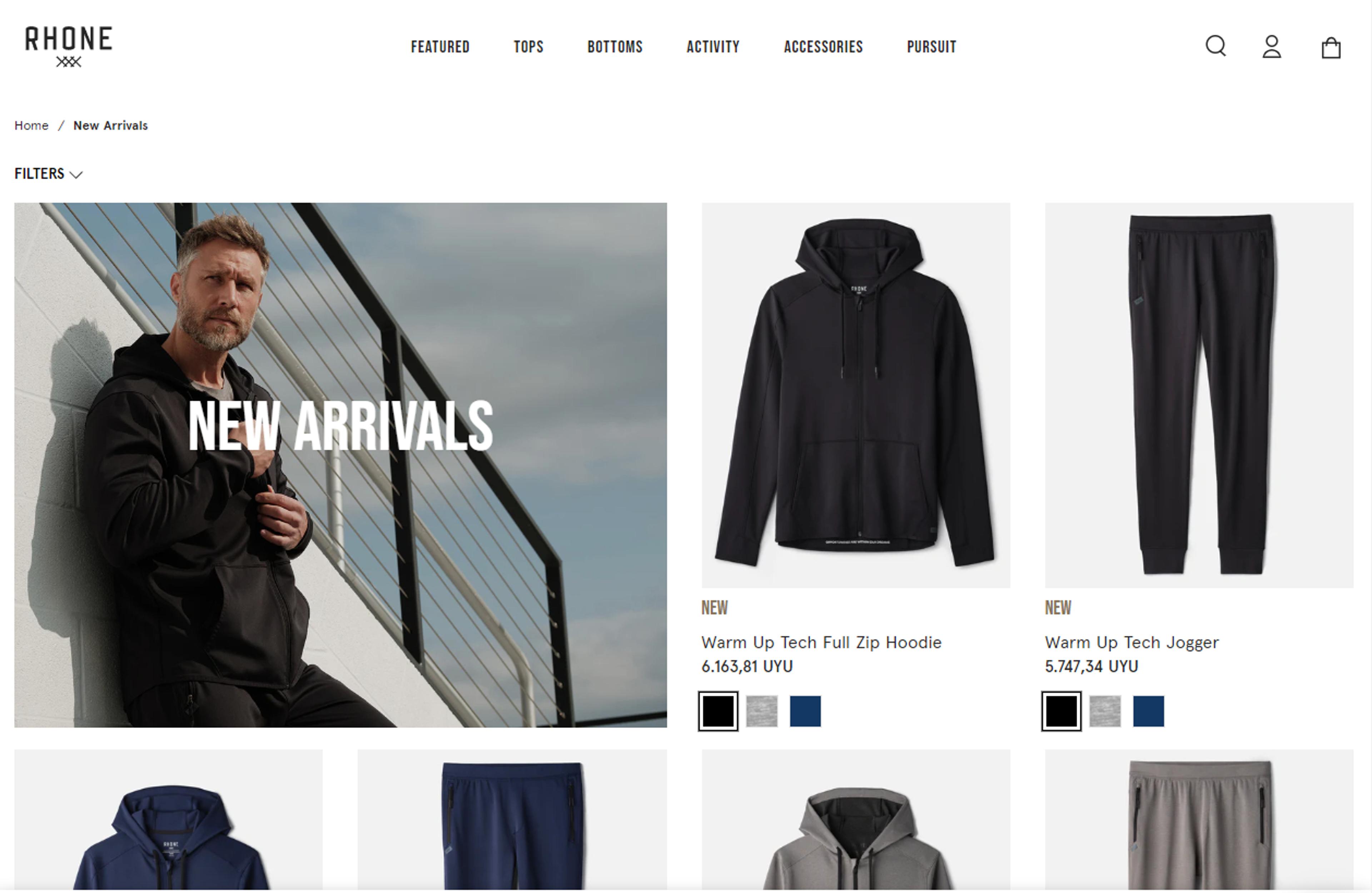
2. Rhone
A group of businesspeople with a love of sports created Rhone. The lack of high-quality sportswear on the market demoralized its founders, so they decided to step in and close the gap themselves.
Rhone's product selection is simple to browse, and the appealing layout and high-quality images make it easy to find exactly what you're looking for. Customers are drawn to the products by the bold contrasting fonts.
A list of publications from well-known magazines featuring Rhone's products can be found at the bottom of the page.
What Makes Rhone A Great Shopify Collection Example?
Rhone is a great illustration of how using the right color scheme, layout, and images can have a greater impact than using flashy graphics everywhere.
- Bold fonts and excellent typography
- CTA button that is appealing and functional
- Simple to streamline
- Full-width and excellent images
- Product pages have an organized design and strong copy
- Product categories and lists are organized well
- A list of publications sponsored
- Carts are accessible with ease
- Educative and informative "Community" page

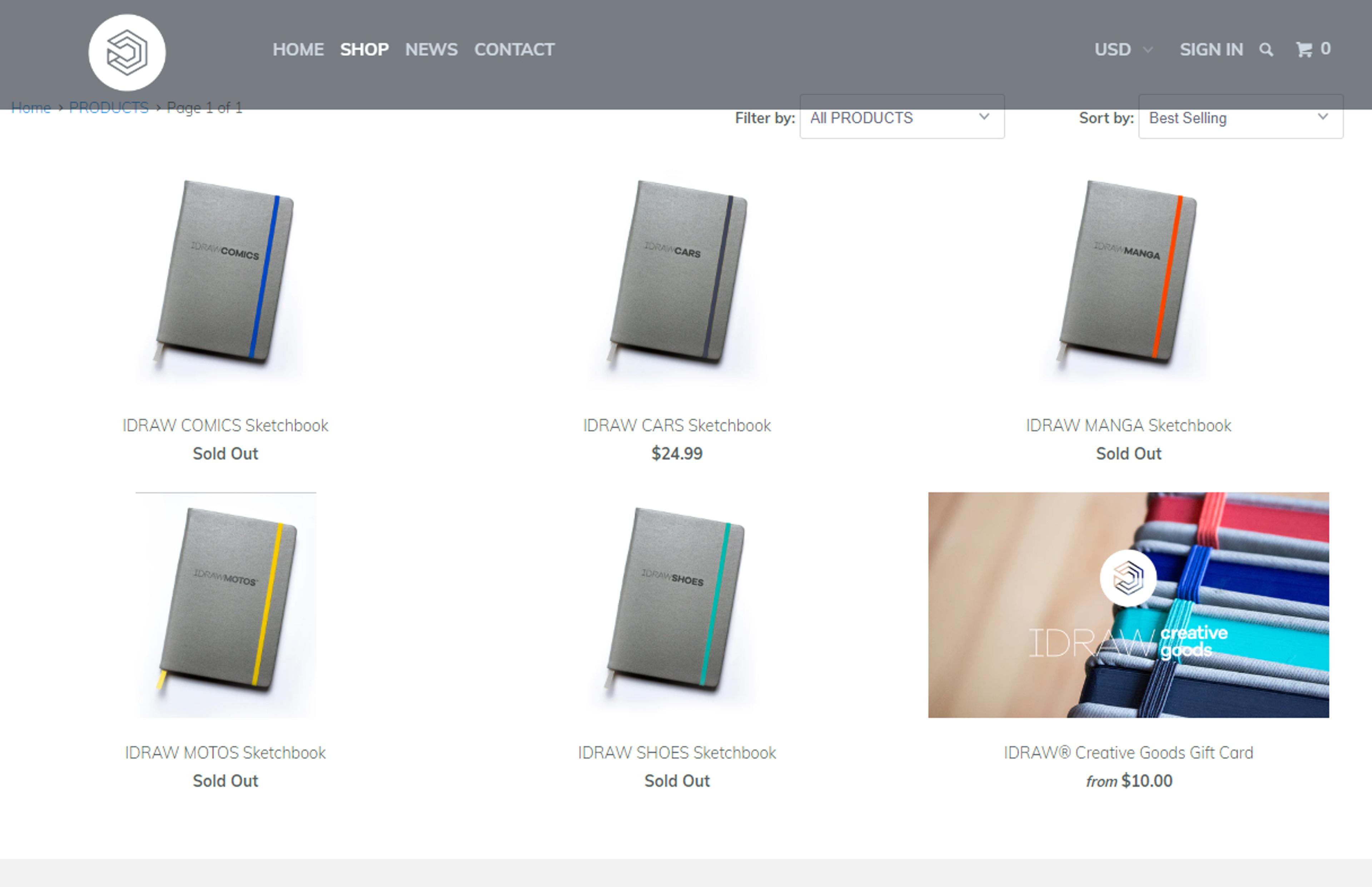
3. IDRAW
IDRAW offers a selection of luxury sketchbooks made especially for different kinds of artists. They sell manga, car and shoe designs, and comic sketchbooks. For each of their products, they include industry reference materials.
The website's user-friendly navigation and abundance of full-width, high-resolution images persuade visitors to discover their artistic abilities and purchase a sketchbook. Customers are drawn to the products' bold typography because it stands out against the background and excites them to learn more about them.
Additionally, since their catalog is straightforward and not complicated, it doesn't pass up the chance to feature them prominently on the homepage.
What Makes IDRAW A Great Shopify Collection Example?
It is clear that IDRAW is dedicated to assisting designers in honing their drawing abilities. IDRAW is a fantastic model for online stores with fewer products because of its captivating website and alluring products.
- The sketchbooks are the main focus of the IDRAW homepage, which makes them the star (in a good way)
- Integrated Instagram feed displaying user-generated and social media content
- Images that fill the screen and artistic photography
- Bold, contemporary type
- Balanced use of color
- Instructive product descriptions
- Products and shopping carts are easily accessible
- An interface that is simple and intuitive

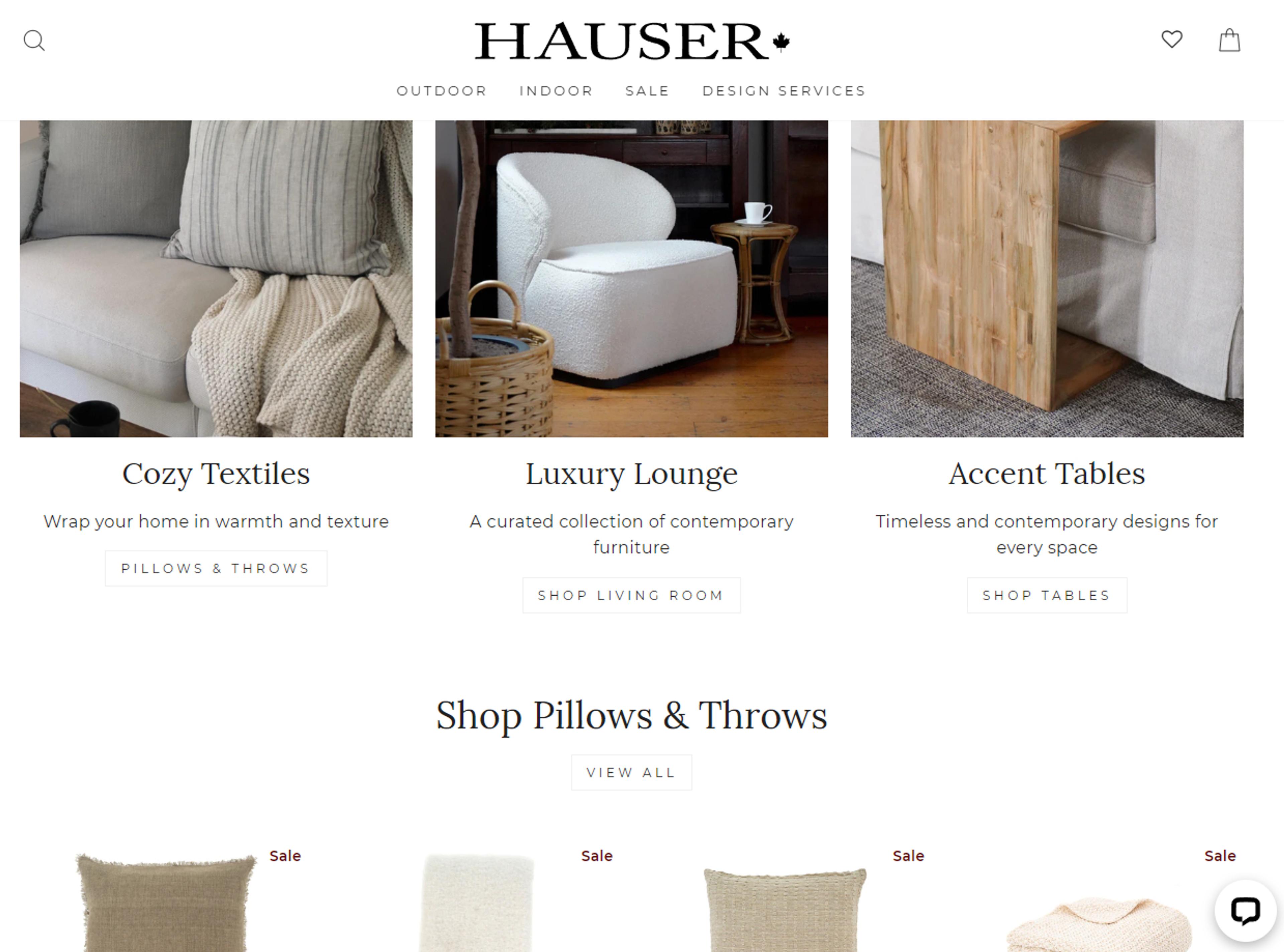
4. Hauser
A Canadian company called Hauser is dedicated to offering high-quality home furnishings for both indoor and outdoor use. The website has a drop-down menu that clarifies several categories and greatly improves browsing.
Due to the size of Hauser's catalog, having this kind of layout makes the difference between a visitor who leaves after becoming overwhelmed and one who makes a purchase.
The website makes shopping enjoyable with high-resolution images, concise copy, and lots of white space, which makes sense given that most homeowners want their space to feel pleasant.
What Makes Hauser A Great Shopify Collection Example?
Hauser is the best illustration of how to categorize your products and improve the shopping experience for your customers if you have a large catalog. The organization of its menus, categories, images, and fonts are all important elements that influence its overall success.
- The drop-down menu is excellent and makes shopping simple
- Images that are high-resolution and full-width
- Bold, large fonts and tasteful typography
- Beautiful CTA buttons
- Simple checkout procedure
- Messenger for live chat
- A simple layout with adequate white space
- Presents the goods at the appropriate time and location
- Encourages examining categories rather than specific products

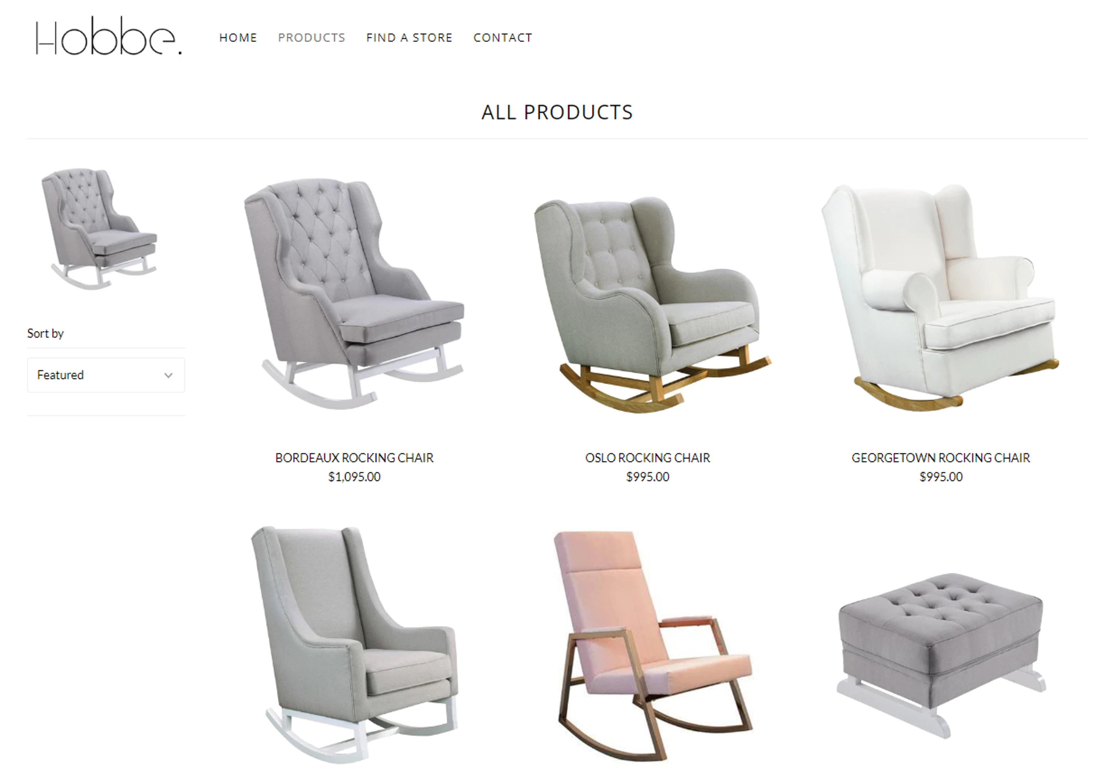
5. Hobbe
Australian minimalist retailer Hobbe specializes in selling only rocking chairs. It was created by a mother who became inspired after being unable to find a rocking chair that was suitable for her own use.
The minimalist and uncluttered design of Hobbe's website complements the style of their comfortable but fashionable rocking chairs.
There is very little copy on the homepage. It only displays pictures of an appropriate baby bed and a rocking chair. Visitors could then shop solely with their eyes by selecting a chair they like and clicking to view the product page.
What Makes Hobbe A Great Shopify Collection Example?
Hobbe shows you how to use an incredibly simple website to sell products and use high-quality photography to encourage purchases.
- A minimalist, contemporary layout gives the store an upscale appearance
- Wonderful product photography that vividly depicts the chairs
- Attractive and tidy layout
- Beautiful typography
- A plain white background that humanizes the goods
- An interface that is simple and intuitive
- Product descriptions that are instructive
- Smooth transaction process

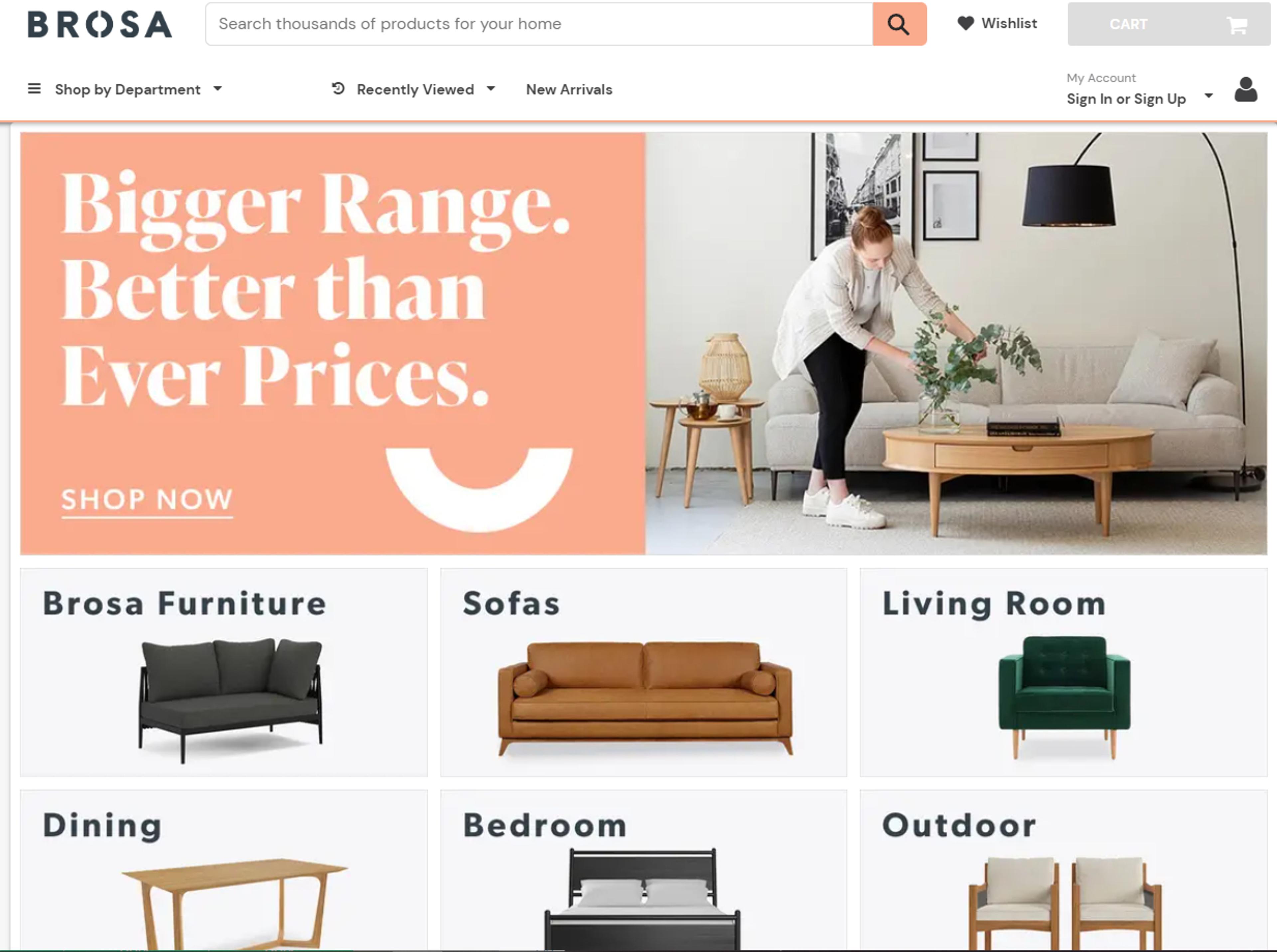
6. Brosa
The modest design studio (Brosa) has a lofty goal: to produce exquisite furniture at reasonable costs. Brosa uses full-width, high-quality images to make products come to life and uses enticing CTA buttons to guide online users down the purchase path.
The homepage header's prominent location makes it very simple to browse the available products.
Additionally, their product pages are jam-packed with thorough images, video demonstrations, FAQs, and customer testimonials that assist in making an educated purchasing decision.
What Makes Brosa A Great Shopify Collection Example?
Brosa is an all-inclusive online store that excels at everything it does: excellent design, harmonious color combinations, user-friendly menus and layouts, persuasive copy, videos, and an overall great shopping experience.
- Mobile-first design
- A vibrant color palette and high-quality design
- Central homepage header for easy navigation
- Striking CTA buttons
- Full-width and high-quality images
- Minimalistic and straightforward typography
- Details product pages showcasing product footage, high-quality shots, and insightful reviews.

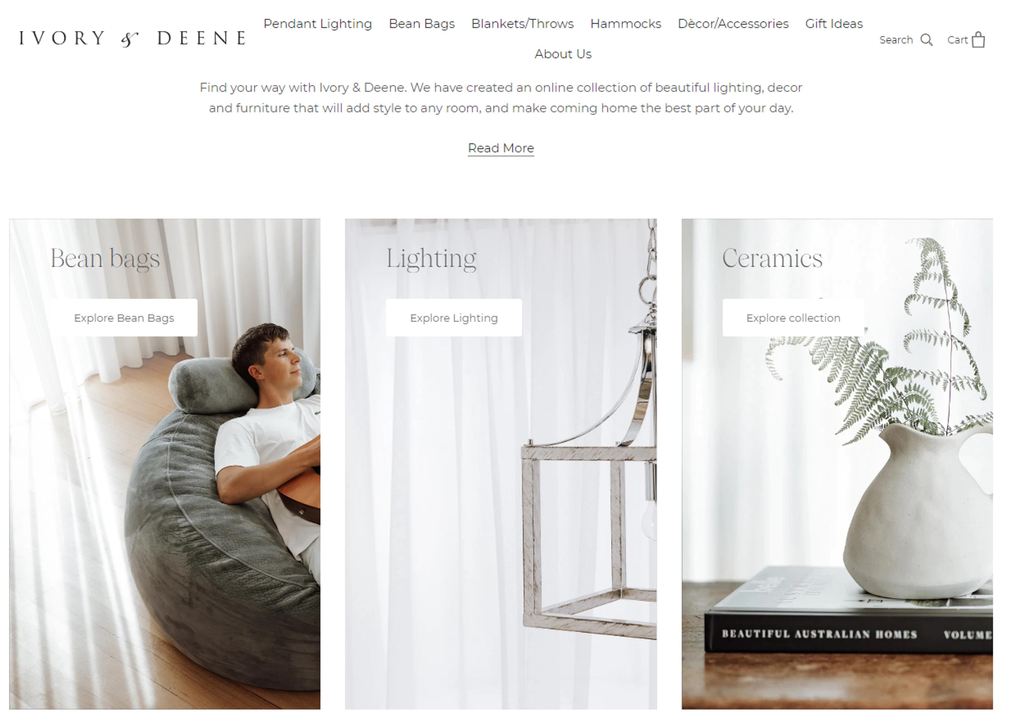
7. Ivory & Deene
A high-end home furnishings retailer - Ivory & Deene, makes significant donations to Australian charities. The team concentrates on selling a variety of furniture and decorations, including high-end items like chandeliers, when they are not working to save the world.
The website uses a lot of white, the product collections are simple to browse, each item has multiple images, and the checkout procedure is quick and easy.
The full-width banner is consistent with the store's design and makes it easy to move around inside.
What Makes Ivory & Deene A Great Shopify Collection Example?
Ivory & Deene is sophisticated, uses a lot of white colors, and strives to make shopping as simple as possible. It is possible to learn a lot by exploring their website.
- A refined, uncluttered layout
- Easy-to-use menus and interface for shopping
- Simple fonts and white colors
- Superior product pictures
- Non-obtrusive email form
- Instagram feed embed
- Product pages that are image-driven and have a simple checkout process.

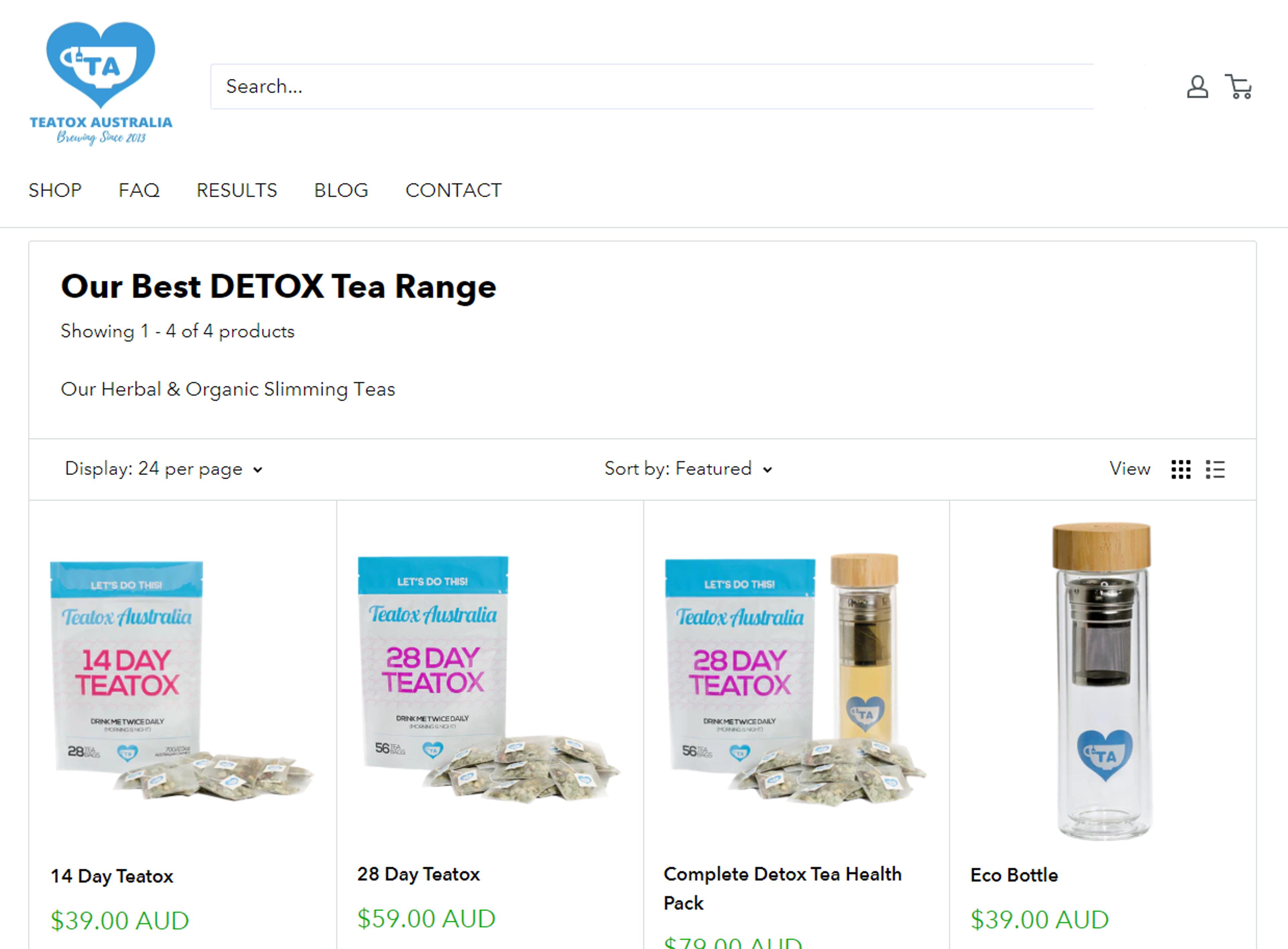
8. Teatox Australia
Teatox is a one-product shop established in 2013 to assist individuals in losing weight naturally through tea detoxing programs. Their website maintains a clutter-free interface while displaying excellent quality and color images.
The menu section is at the top of the page and has legible typography. The blog section is also cleanly organized and has eye-catching graphics. Their tea helps people lose weight, and the homepage explains how its active ingredients do this.
Additionally, there are numerous bundle options available.
What Makes Teatox A Great Shopify Collection Example?
Although Teatox's website has a large header, it is still very well designed. Numerous objections are addressed, and using the product is made simple.
- The homepage gets a nice personal touch from the distinctive blurb icons
- A small but telling detail about their use of transparent backgrounds for product images is their visual flair
- Products and shopping carts are easily accessible
- Smooth transaction process
- It's a fantastic illustration of customer education-focused content marketing
- An attractive blog section with a good layout
- Product features are explained clearly.

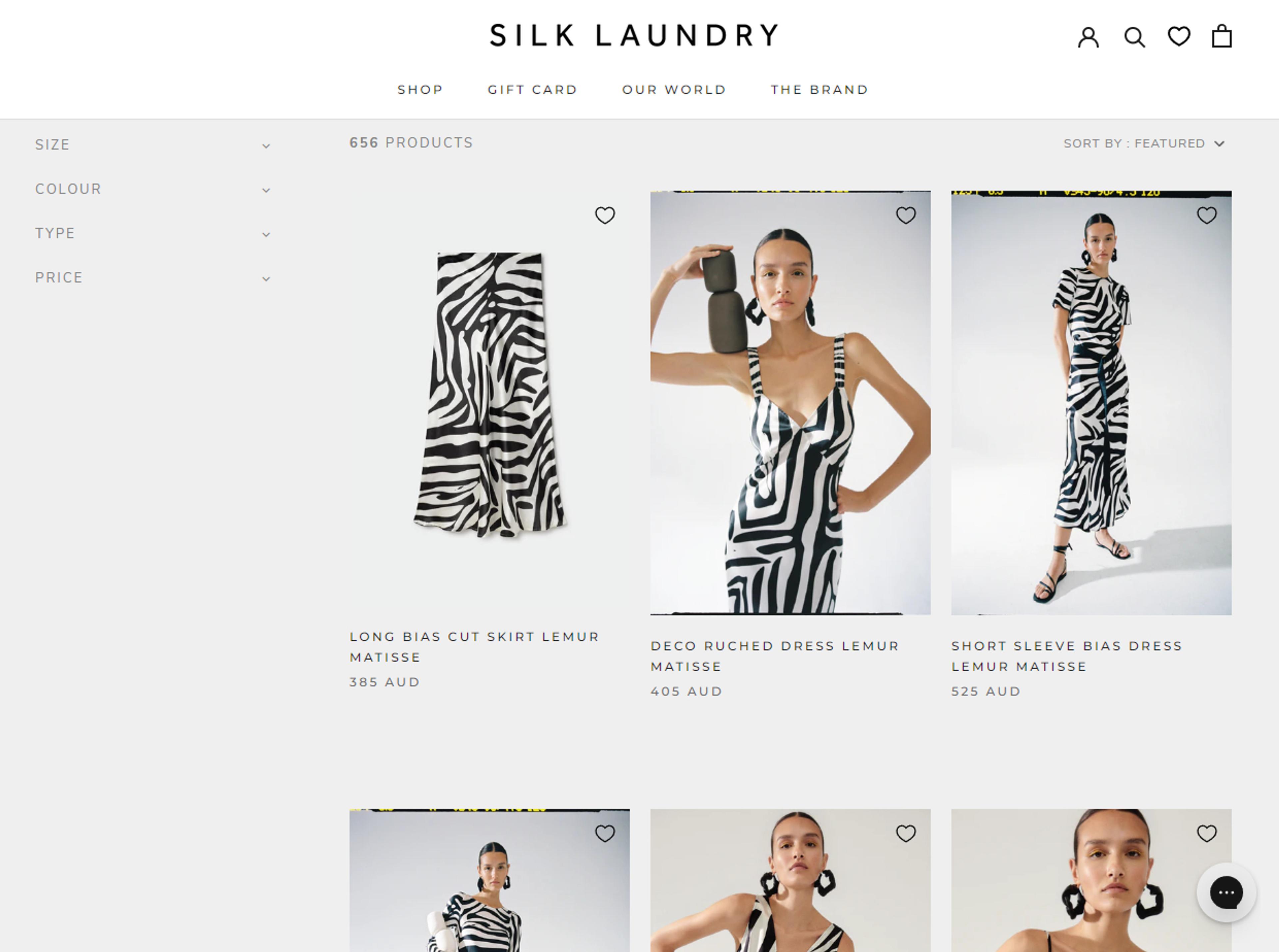
9. Silk Laundry
Women's classic silk clothing from Silk Laundry defies fashion trends. They keep their business small so they can devote enough time to each piece to make it perfect.
All their products are handmade. It's enjoyable to browse Silk Laundry's product selection. Customers can get a better idea of the product's feel thanks to the high-quality images. Some listings even include smooth-styled product footage. Product descriptions feature beautiful typography.
Additionally, the website has open "Shipping and Returns" and "Reviews" pages that foster customer confidence. Plus, the overall layout is simple to use without requiring too many clicks.
What Makes Silk Laundry A Great Shopify Collection Example?
You can learn from Silk Laundry how to use video to make each product stand out and enhance the shopping experience.
- A simple layout with gorgeous colorful images
- An Instagram feed that is integrated and serves as both a showcase for their designs and user-generated content
- A fun "Journal" page with concise and useful articles
- Product details that are transparent and clear
- Attractive CTA button against a white background
- Access to products is simple
- A discreet email signup option
10. Warren Rise
Western Rise is a clothing shop for men, and it's all about versatile clothing that can fit any occasion. The homepage features a dynamic full-width image that gives a great first impression.
It starts presenting some of the products right after you start scrolling, showing their specifications and, most interesting, their use cases. Not only that, their catalog is straightforward to navigate with simple categories. Plus, the journal features detailed blogs that help men know what to wear.
What Makes Western Rise A Great Shopify Collection Example?
Western Rise excels at presenting goods in the ideal light. It makes it simple for a customer who just wants to look at more options.
- A timeless, understated design that makes good use of typography
- Beautiful images are provided for each item of clothing
- A picture that fills the entire hero page
- Displayed product images from various perspectives
- Simple payment and product access
- Excellent and beneficial blog posts
- Well-designed layout and product collections
- Instagram feed embed

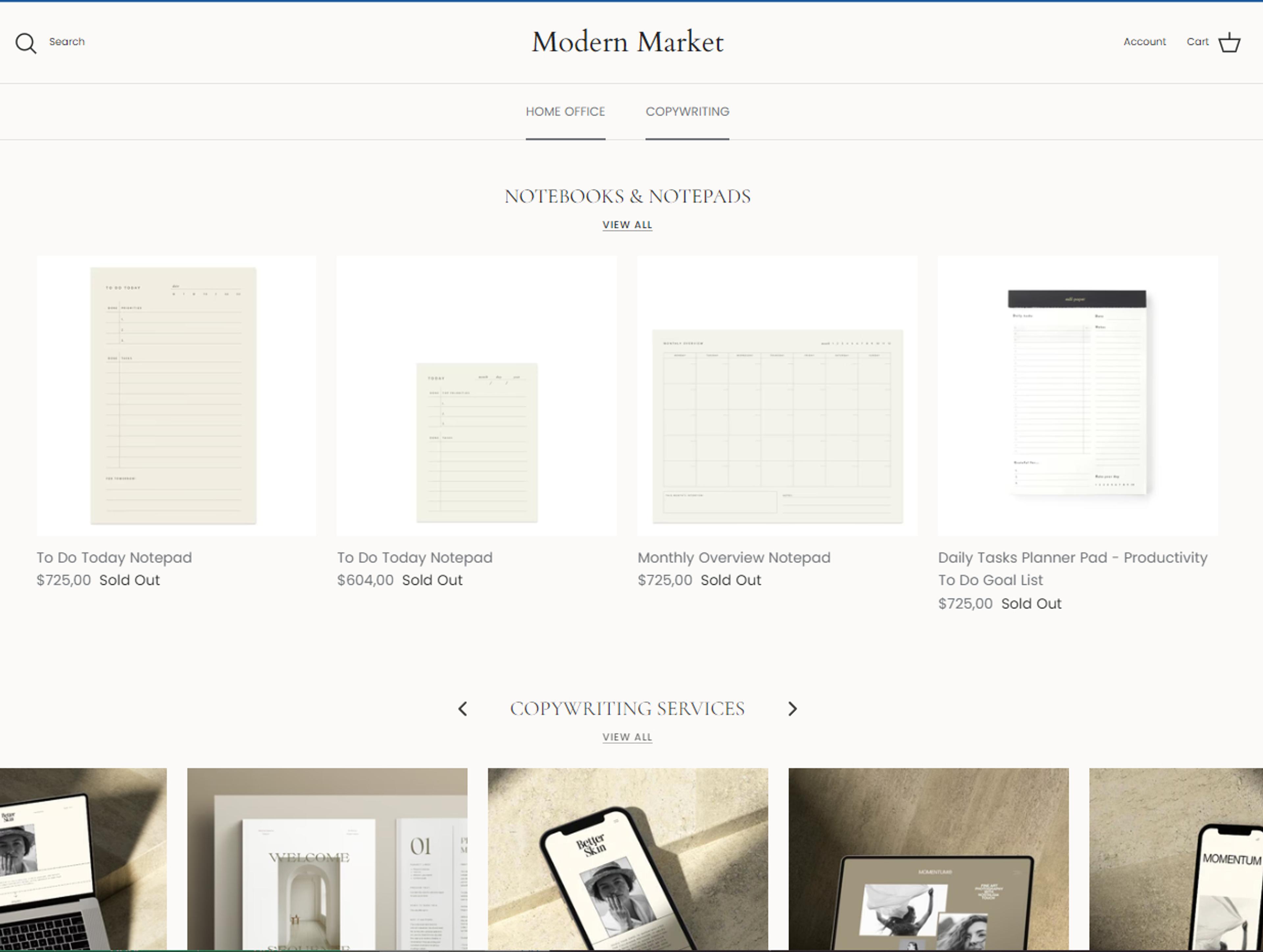
11. Modern Market
For photographers, Modern Market has a wide range of designs. These consist of page templates, legal forms, lightroom presets, and more. Modern Market provides everything, and it does so without skimping on the design.
The website of Modern Market has a simple, minimalistic design that is enhanced by elegant photography. They outline what is contained in the preset and provide instructional videos on how to use them, offer a copy with a money-back guarantee, numerous previews, and FAQs.
The website is dedicated to matching the right customer with the right product.
What Makes Modern Market A Great Shopify Collection Example?
Modern Market provides its customers with so much value. Moreover, reading and learning from the website is a painless experience due to its excellent design.
- A simple, minimalistic style using soft hues
- Fantastic landing pages that are both lengthy and for each product
- Images that fill the screen and artistic photography
- Products and shopping carts are easily accessible
- A list of sponsored publications
- Educational and informative videos
- Educative and entertaining blog posts
- Balanced use of color
- Simple to streamline
- Many resources are available for photographers.
Tips And Tricks For Creating High-Converting Shopify Collection Pages
You want the tips and tricks to creating high-coverting Shopify collection pages? Read on and see what works.
Apply Killer CTAs
What you tell or ask your customers to do next is referred to as a call to action. This is an immediate method of raising consumer engagement with your brand. You can motivate your customers to respond to your CTA by evoking specific emotions, such as FOMO or excitement.
Also, you can use pop-ups in addition to banners to entice customers with all your exciting offers and discounts.
Build, test, and iterate on Shopify without the dev time
Replo has hundreds of templates to help you launch and test new landing pages - without writing a line of code.
Use Compelling Headers
Headlines are excellent for grabbing attention and showcasing your brand's mission. Why? They are the first thing visitors see on your collection page. Promote your top featured products, sales discounts, and special offers in the header section to make the most out of the page.
More conversions are likely to occur if you successfully capture a buyer's attention and make a great first impression (i.e., by being valuable and informative).
Provide An Excellent Product Layout
It is best to use all the space available when designing your product. You can use a grid view or list view to accomplish this. Grid views are typically the best for a visually enhanced experience. No specific information is required to be included in the design, as most customers use full images to compare products.
Fashion and beauty companies like H&M frequently use a grid view to highlight their best products. Use two to four images per line for the best user experience.
However, the one product per line view might be the best option for sectors requiring more specific specifications, such as food or electronics.
Keep The Best On Top
Let's return to making a positive first impression. Try to showcase your best-sellers at the top of each collection page to foster a sense of trust and encourage customers to make purchases. By directing customers to your best-selling products with badges that read "Best Sellers," "New Arrivals," or "20% Off," you can step up your game even more.
Highlight Pricing And Lure Customers In With Inviting Triggers
An added benefit is always a fair price. Products with fair prices that include promotions, flash sales, list ratings, and reward points! A compelling collection page must have appealing product thumbnails.
This is even more true for industries that rely heavily on visual cues, like fashion or apparel. The collection page's thumbnails should, at their best, complement the aesthetics of the brand and simultaneously give customers a quick impression of the products.
Get Creative With Shopify Collection Pages
A Shopify collection page is a great way to incorporate creativity and provide visitors with an enjoyable experience. It's also the perfect opportunity to inspire customers and make them excited about your brand. Leverage the above Shopify collection page examples to get inspiration and develop ideas for your own unique design.
And, if you don't have the time or are still unsure of how to get started, Replo is here for you! We have years of experience in the industry, and our team of experts can turn your vision into a reality.
Book a demo today to learn more about how we can help you create stunning and high-converting Shopify collection pages!