Get the Latest
Access ecommerce tips and resources, right in your inbox.
How To Design A Custom Shopify Product Page That Sells
Nowadays, the ecommerce landscape is so cluttered that stores without a unique and customized product page find it difficult to stand out. While Shopify’s default themes enable smaller-scale edits for their pages, larger-scale edits are often unavailable. Read more to learn about the basics of custom Shopify product pages, examples of product pages that have worked, and how you can create a custom Shopify product page that sells.
Without a doubt, the product page is where customers spend the most time on an ecommerce site.
The page not only represents your brand but also provides all the necessary details to inform their purchasing decision, from the cost, to the description, to the ratings and reviews of a product. If your product page doesn't entice them, then you've already lost the sale. In fact, many single-product Shopify stores find their product pages so vital that they use them as their home pages.
In this article, we'll explore how to design customized Shopify product pages, analyze successful examples to see what makes them work, and discuss how to customize our own.
What Is A Shopify Product Page?
A Shopify product page is where you lay out all the details of a given product in your online store. The page should be straightforward for customers to browse and investigate comparable products.
But it's not just a list of specifications—it’s your product's mini-marketing page. This page needs to convince visitors to hit the "Add to Cart" button by showcasing the product’s details, features, prices, social proof, and assurances. In many ways, a well-crafted product page can make or break a sale.
If you are looking for a quick way to start building, website product page templates are always a great way to get inspired.
Shopify Products vs. Shopify Collections
When setting up a Shopify store, you'll encounter many terms. Two key ones to understand are products and collections. Organizing your products well is crucial for a user-friendly online store, but you also need to make it easy for customers to browse similar items. Let’s break down the differences between Shopify products and collections to help you get organized.
What Is a Product?
Products are the items you sell, whether they’re physical goods, services, or digital downloads. When you add a product to your Shopify store, you input detailed information and images. From the Shopify Items admin page, you can then change and organize your products and product variants. Each product needs a "type"—a top-level category like clothing, footwear, etc. A product can belong to multiple collections but have only one type.
What Is a Collection?
Collections group products to make them easier for customers to find. You can categorize products by price, size, color, season, theme, or sale items—whatever works best for your store.
Collections can appear as item photo galleries on your site, and customers can click through images to individual product pages. You can also add links to collections in your navigation menu to make your collections easier to find. Your collections are visible and editable through the Shopify Collections admin page.
Manual vs. Automated Collections
You have two options for creating collections in your Shopify store: automated and manual.
Automated Collections
Automated collections use "selection conditions" to automatically include products that meet specific criteria. You can set up to 60 conditions per collection, and products are added automatically when they meet some or all of these conditions. It's a set-it-and-forget-it method that saves time.
Manual Collections
Manual collections contain only the items you personally select. While they require more time to update, they offer a personalized touch. Manual collections are great for seasonal or special sales, allowing you to create and remove smaller collections as needed.
By understanding these key concepts, you can better organize your Shopify store to enhance the shopping experience for your customers.
Product Page versus Landing Page
Many folks in the ecommerce space tend to think that a landing page and a product page are interchangeable terms. But that isn't the case at all. A landing page is an effective marketing tool designed to boost conversions and funnel customers directly into your sales process. On the other hand, product pages are great for sharing detailed information.
Understanding the purpose and differences between these pages can make it easier to use them effectively in your marketing strategy. Both are valuable, but knowing when and how to use each will enhance your efforts.
What Is a Product Page?
A product page is detailed and educates consumers about a specific product or service. It should clearly convey the essence of your offering. The information should be broad enough for anyone to quickly grasp key points but detailed enough to inform customers fully. Product pages often guide customers through your site with helpful links to additional information.
Ensure that all essential details about your product or service are available on this page, or at least direct customers to where they can find more information. Different industries might have specialized areas that require extra knowledge, and your product page should provide easy access to these areas.
What Is a Landing Page?
A landing page should be the opposite of a product page in terms of content—it should be information-light. Its sole purpose is to persuade visitors to take a specific action, or convert, where they can become leads or paying customers.
Landing pages contain minimal content to eliminate distractions and focus entirely on one message: the call to action (CTA). The CTA is the action you want the customer to take, and your landing page should be designed with that in mind.
Landing pages are essential to your marketing strategy because they offer a direct and distraction-free way to deliver a unique customer experience and convert visitors. After familiarizing visitors with your product or service, present them with an irresistible offer. Each marketing campaign should have tailored landing pages to meet the needs of different buyer personas.
Creating a landing page with a CTA encouraging visitors to download an ebook or get tickets for a webinar in exchange for their email address is a great example of a marketing campaign. Although the sign-up is free, you need the user’s email address to access these resources.
Once you have this data, you can build a database and send customized marketing materials, such as new product information, special offers, or promotions. If your goal is to turn visitors into customers, tailor your messaging to specific offers, like a buy one, get one free deal. Highlight that this exceptional deal is only available for a short time to create a sense of urgency and drive conversions.
Examples Of Top Custom Shopify Product Pages
To better understand what top-class product pages on Shopify can look like, let’s take a look at a few of our favorite examples:
Master & Dynamic
When you visit a Master & Dynamic product page, you encounter a design that whispers luxury and sophistication. High-resolution close-up images highlight the craftsmanship of their headphones, and the product listing comes with options to customize customers’ purchase with “collaboration colors” and add personalized engravings to the product.
This visual appeal is complemented by detailed descriptions in a vertical grid format that focuses on both the product's emotional experience and technical specifications. In addition, a full width section breaks down product guarantees such as free shipping, free returns, and product protection to increase customer confidence in the brand. The goal here is to captivate, but not overwhelm.
Kettle & Fire
Kettle & Fire’s product pages are a feast for the eyes, showcasing high-quality images of their bone broths and soups. The page layout includes a carousel of product photos, lifestyle images, and infographics that clearly display nutritional information. Customer reviews are prominently featured in a carousel format near the top half of the page to strengthen audience trust and confidence in the product. In addition, detailed nutritional information is highlighted in an organized manner with an accordion style drop-down menu.
Finally, the product page comes with discounted rates for buying in bulk, with text that informs the viewer on the unit price and how much they’re saving per bulk purchase option. This makes it easy for customers to compare prices versus quantity and incentivizes them to choose the larger-quantity option with the most savings.
Studio Neat
Studio Neat’s product pages are designed to provide a comprehensive purchasing experience. When you land on a page, you’re greeted with close-up eye catching images and a video introduction to the company and its products. As you scroll, you'll find detailed descriptions, social proof, and a further breakdown of the product.
This combination makes you feel like you’re holding the product in your hands. The page also provides lifestyle images that highlight the product in various real-life contexts, reinforcing the brand’s identity. Finally, it concludes with a row of related products in an “Also Check Out…” section to incentivize additional purchases.
Pourri
Pourri’s product pages reflect a bright, lighthearted, humorous brand tone. The pages combine informative product descriptions with vibrant imagery and strong colors to engage customers.
From the top of the site, we are given a clear list of product benefits, star ratings and reviews, as well as options for bulk purchases and subscriptions with customer savings highlighted beside each option. In addition, Pourri provides the option to “Shop on Amazon” to make it more convenient for potential customers to add the product to cart, no matter which platform they like to shop from.
Finally, the page does a great job of expressing their quirky brand personality through informative sections labeled “Clear The Air With Home~Pourri” to provide more detailed product information, “A Multi-Purpose Odor Freshener Without Any Bad Crap” to highlight key features, and “THE INTERNET HAS SPOKEN: People Funking Love the Scents of Home~Pourri” to present customer reviews.
All together, these elements help communicate Pourri’s brand identity while effectively informing the viewer.
What Should A Custom Product Page Include?
To make the most out of your Shopify product pages, make sure to include the following components:
Product Details
Consider using custom layouts and design elements to present your product detail pages beyond the regular template design. If you’re looking to customize your product page beyond its design, try incorporating non-product-specific material such as:
- Highlighting the history and about section of your organization
- Highlighting your design methodology and resources using text and graphics
- Including links to other independent informational pages on your website
- Including a form for customer feedback
- A live chat bubble to address any customer concerns
- Featuring your best blog entries
Images And Videos Of Your Product
Add high-quality and informative videos to your product pages to give a better perspective of your product to prospective buyers. Examples include demo videos to showcase how the product works, as well as use case videos to highlight how the product looks in real life.
Related Products Section
Remember that a customer looking at the current product might decide it is not the best fit for what they’re looking for. In this case, the related products content section would be your chance to offer them additional possibilities that might be a better fit.
Displaying other product configurations, such as sets or multi-packs, is a viable alternative to encourage further purchases. Another option is to showcase items that are similar in style, color or product type, that also might match the viewer’s interests to boost purchase totals.
Recently Viewed Products Section
Another great content section is to add recently viewed products. Not only does this give shoppers a way to easily backtrack to a product they just saw, but it's a great way to personalize the experience for each shopper and add a dynamic dimension to your site.
How To Customize Product Pages On Shopify
If you are seeking ways to customize or edit your Shopify product pages, you are on the right track. A well-customized product page can represent a unique image of your brand, deliver a better user experience, and help increase conversions.
Product Page Customization Within Shopify Admin
Within Shopify Admin, you can go to Online store > Themes in your Shopify admin to begin modifying your Shopify product page template. To access the page where you can alter the theme, click the Customize button.
From the drop-down box, choose Product pages, and then begin modifying your product page template details such as font, call-to-action (CTA) buttons, cart page design, typography, etc.
If all you need to do is make a few minor adjustments like these, then keeping the theme's default settings is the ideal choice because it doesn't need any coding, doesn't require an expert, and lets you make changes whenever you need to.
Using Shopify Page Builder Apps
If you are looking to make larger-scale product page layout edits with numerous sections, or if you would like to finetune your page design through an iterative A/B testing approach, then you may find that Shopify themes’ default installations are not enough.
On top of that, most themes on the market don't allow you to change the fact that Shopify product pages are often restricted to the design features you see in your store admin, such as the arrangement and positioning of items on Shopify product pages.
To get around that, what you need are page builder apps that allow you to quickly and easily customize Shopify product pages (and other sites) on your own. To access them, you can search up the phrase "page builder" to search for more than a dozen page builder applications in the Shopify app store. If available, product page templates are always a great way to get inspired and start building.
Customize Your Shopify Product Pages with Replo
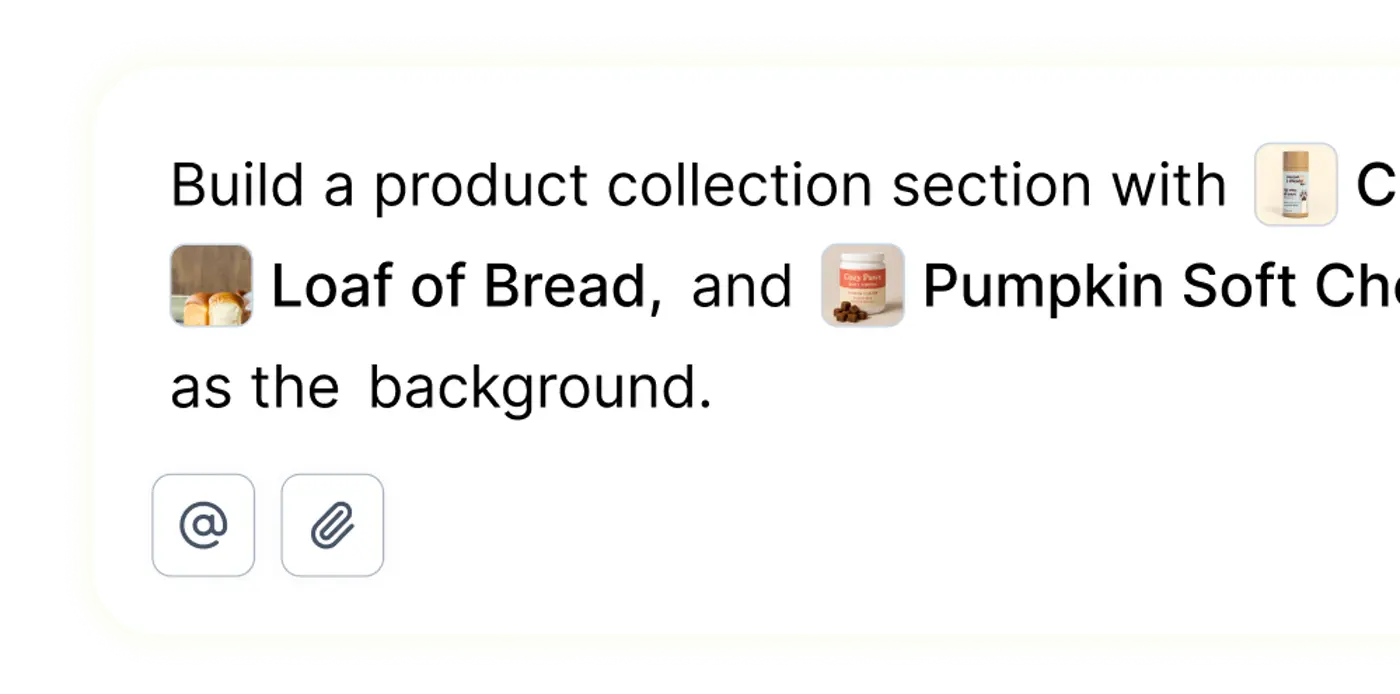
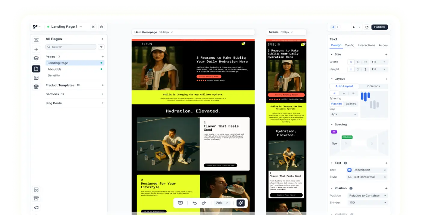
With Replo, you can build pages for your Shopify store in an easy-to-use and no-code editor, you can also access our collection of hundreds of landing page templates inspired by top brands to start building your own landing pages. Browse through them to get started and save time by adapting a template (or however many as you like) for your own site.
In addition, Replo integrates directly with Shopify, pulls in your Shopify catalog data, and publishes directly to your Shopify theme, meaning that you can start building in minutes with a top landing page builder designed for Shopify.
Best of all, Replo comes with a community of professional Experts for hire and 24/7 support to help you make the most out of Replo. For more informational resources on all topics related to marketing and ecommerce—from comparison shopping engines to dropshipping to A/B testing—check out our blog!
Visit us to get started, or reach out to schedule a demo with us. Join our Slack community and follow us on X to stay updated.
trusted by over 5000+ brands and agencies