Anatomy Of A Landing Page
Learn the anatomy of a landing page, key elements, and testing tips to boost conversions fast.

Last updated: 2026-01-08
Takeaways
The structure of a landing page is relatively consistent across brands.
Usually, they all consist of these sections in the following order from top to bottom: the hero section with it's headline, the product section or product buy box, the product benefits, social proof, and the FAQ or upsell section at the very bottom.
Specific elements to include are quality visuals, strong CTAs across the page, a clear value proposition, and streamlined forms and checkout process.
What Is A Landing Page And Why Structure Matters
The anatomy of a landing page defines how each section persuades and guides visitors toward a single conversion goal. A landing page differs from general site pages by stripping away distraction and focusing on one action—such as signing up or purchasing.
Landing pages sit at the intersection of awareness and decision within a top of funnel marketing strategy, turning curiosity into measurable business outcomes through structure and focus.
What is anatomy of a landing page?
The anatomy of a landing page can be broken down into the following—headline, hero, product offer, high quality visuals, social proof, strong guarantees, and calls to action—designed to focus attention on a single conversion. You use it to reduce friction and guide clicks to buy.
Landing Page Elements You Cannot Skip
You don’t need a thousand parts, but you do need the right ones working in concert. For added perspective on common patterns and examples, review Wix’s guide on essential landing page components and why they matter across different layouts.
Headline and Value Proposition
The headline captures first attention and communicates value fast. Clarity beats cleverness, and message match between source ad and page ensures continuity.
Pair it with a unique selling proposition that explains why your offer is the best fit.
- State the primary benefit in the first few words.
- Aim for a headline under 20 words, ideally around 10, prioritizing clarity over cleverness.
- Mirror the wording from your ad or email to keep continuity.
- Use a short subhead to add context or quantify results.
- Avoid jargon; aim for concrete, familiar language.
Hero Image Or Video
Visual storytelling establishes trust. Use real scenarios or product visuals in context rather than distractions. If your story is complex, a short video can lift comprehension quickly.
One HubSpot analysis found that 39% of marketers reported ROI from short‑form video, reinforcing its role for fast and engaging explanation above the fold.
- Use WebP or AVIF and right‑sized images to protect speed.
- Keep clips short and stream them; lazy‑load below‑the‑fold media.
- Use high‑contrast, legible thumbnails that clarify the promise.
- Confirm captions work muted; many visitors watch without sound.
Benefit Bullets
Translate features into outcomes people feel. Each bullet should answer “so that” and describe the after state. Prioritize the top three to five near the first button.
Focus on how the product improves the customer's life or solves a problem.
Avoid unnecessary details and use persuasive language aligned with your brand voice.
Social Proof Blocks
Use specific proof that reduces doubt quickly. Combine quick trust signals near the hero with detailed, attributable quotes deeper on the page. Always include names, roles, and measurable outcomes when possible.
Include genuine customer reviews, testimonials, and ratings, ideally with names and photos for authenticity.
You should also display trust badges, security seals, publicity mentions by top publications, and accepted payment logos to reassure visitors, especially during checkout.
Call To Action Button
Your Call To Action (CTA) is the page’s trigger, so clarity beats charm. For a deeper dive into language, placement, and testing, read our guide on how to write a call to action and how to craft high‑click variations.
- Use first‑person copy when helpful (e.g., “Start my trial”).
- Make the primary button the highest‑contrast element.
- Place a primary CTA above the fold and repeat at key sections.
- Reserve secondary CTAs for hesitant visitors, not the hero.
- When your webpage is in mobile, make sure to feature large, easily tappable buttons that hover on-screen near the bottom right hand corner.
Minimal Navigation And Footer
Strip navigation down to the essentials to prevent traffic drop-off. Include only required policies and a light help path at the bottom of the page. Give visitors fewer options so they don't get lost or confused, and a clearer next step.
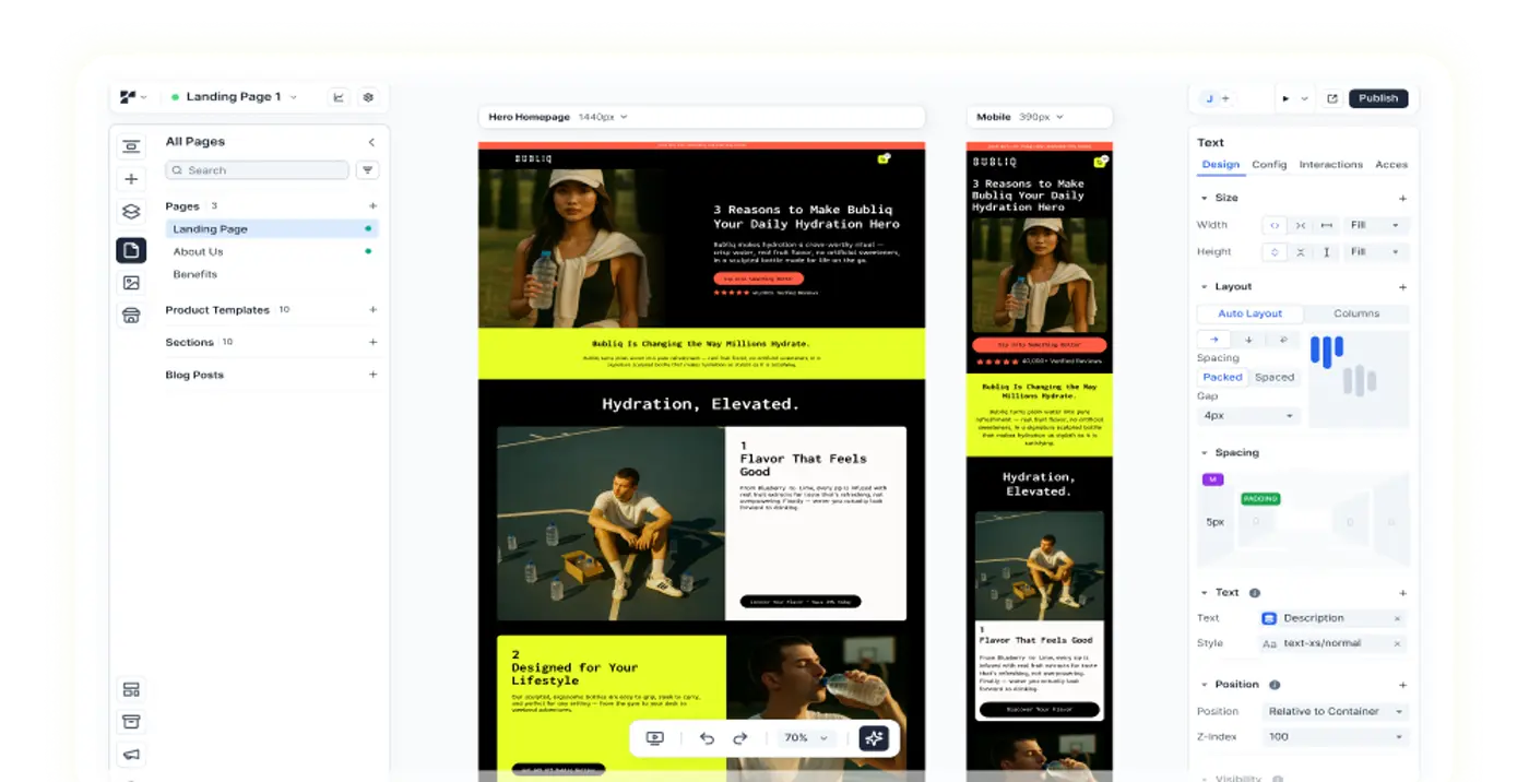
Mobile-Optimized Design
With over a projected 63% of ecommerce revenue coming from mobile devices by 2028, a mobile-first approach is essential if you want to capture more customers.
Landing pages must be responsive and provide a seamless experience across all devices. Plus, mobile devices have the highest cart abandonment rates, emphasizing the need for optimization.
Fast loading speeds are crucial on mobile. Use large, tappable buttons that can hover on-screen and easily readable text.
Single-column form layouts are recommended for mobile; the primary CTA should always be prominent and easily accessible with ample spacing between surrounding text blocks and the CTA button itself.
Ideally, you can add in a full-width section for each of these CTAs on your mobile landing page.
Streamlined Forms and Checkout Process
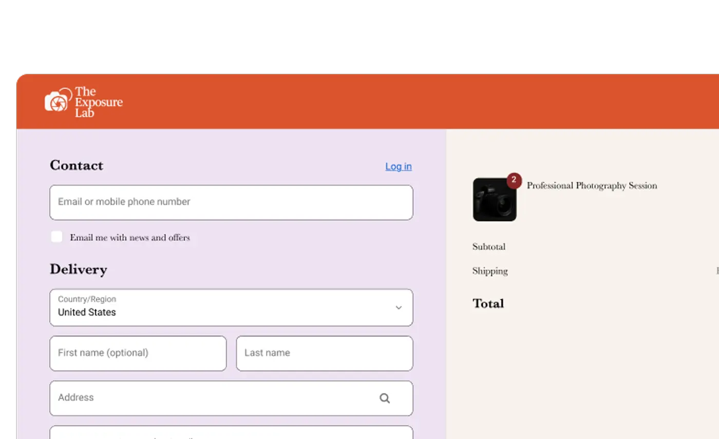
Users want a streamlined experience at checkout. Given that it is the end of an entire conversion funnel, you want to make sure the final purchase process is as fast and easy as possible.
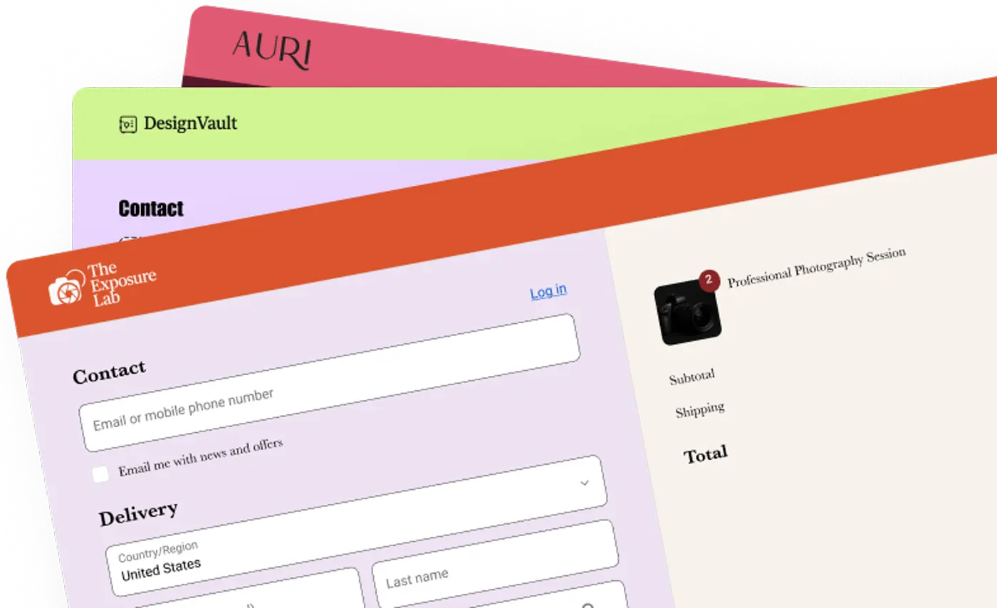
Some ways you can do this include simplifying forms by minimizing required fields to reduce friction and minimizing the steps required in a checkout process.
Offer guest checkout and various payment options, and clearly display all costs upfront to help customers set expectations early on. A progress indicator helps shoppers keep track of how many steps are left during checkout.
Offer saved details for returning customers, so repeat customers can go through checkout faster.
Finally, include guarantees such as a privacy policy, return policy, or 30-day satisfaction guarantee to reassure customers and help mitigate buyer anxieties.
{{get-started="/components"}}
Optimal Landing Page Anatomy For High CVR
Landing pages are crucial for converting visitors into paying customers by focusing on a specific action tied to marketing goals.
Unlike homepages or product pages, they are designed for a singular conversion objective, though the goal itself can range from lead generation to signing up to a subscription plan.
There is variance between landing page types (since different landing page purposes call for different content), but the overarching structure of a Shopify landing page, when ordered from top to bottom of the page, most often looks something like this:
Section 1: The Hero
A hero section with a key headline stating the brand’s value proposition and key product or service offering. The hero section is made to be engaging and eye-catching; the headline should be clear and to-the-point.
The hero section takes up the most precious space on a landing page since it is above-the-fold—meaning it’s the first thing your audiences see—so everything in this section should be tailored towards grabbing your audience’s attention.
This will encourage readers to scroll further down and read more.
Section 2: The Product
Second, there will be a product section. This usually comes in the form of a product buy box for product landing pages, though it can also be just a product image and description with a CTA button leading to an actual product page.
This is where you want to showcase the thing or service you are trying to sell, and highlight the logistics of what or how it’s made or delivered.
Section 3: The Benefits
Third, there will be a benefit section. This is where you want to highlight how your product or service stands out. Like its namesake the benefit section is all about describing the value your brand can bring to customers.
You want to be as specific and clear as possible here. Make it easy for your viewers to envision how your brand is going to solve a problem or improve a situation for them.
Section 4: The Social Proof
Fourth, there will be a rating and review section or user-generated content section. This is where you leverage social proof to build audience trust in your brand.
High-performing best ecommerce stores examples demonstrate consistent use of trust layers throughout a page. Proof isn’t decorative—it’s functional psychology.
- Show customer metrics (e.g. “Trusted by 1M+ users”).
- Add recognizable brand logos near the hero section.
- Display testimonials mid-page to reinforce credibility.
- Conclude with badges or guarantees near the final CTA.
In some cases, this section is arranged nearer to the top of the landing page, or elements of this section are scattered throughout the landing page.
For example, many Shopify landing pages have their star reviews placed right above the product name in the product section, so that viewers can see immediately what other people think of this product.
Section 5: The FAQ and Upsells
Fifth, there will be an FAQ section or a section recommending upsells, additional related products, or even bundles for customers to add into their cart. These sections are meant to help a brand address any viewer concerns to reduce buyer anxiety or to increase their AOV (average order value).
It usually sits near the bottom of the page, but can also be dispersed or arranged throughout the landing page.
For example, some product buy boxes include an FAQ section right under the “add to cart” CTA with common product inquiries. Or, they have recommended products featured under the benefits section to show related products delivering similar value.
Remember, this general landing page structure is not set in stone by any means, but it is an outline that we’ve come to recognize after looking at and working with hundreds of top DTC Shopify brands.
It serves as a strong indicator of what Shopify landing page structure has worked well enough to become part of industry best practice.
Design Tips For Fast Loading Mobile Pages
Design speed impacts user retention directly. Google’s Core Web Vitals show that pages taking longer than 3 seconds lose 53% of visitors. Optimization isn’t aesthetic—it’s performance marketing.
Compress Media Without Quality Loss
Use next‑gen formats such as WEBP and AVIF and right‑sized dimensions for every image. Stream video, lazy‑load below‑the‑fold assets, and compress thumbnails. Keep your hero crisp and light.
Use Responsive Layouts
Design for thumbs, not cursors on a big screen. Preserve CTA visibility and tap targets across breakpoints. Avoid layout shifts that push buttons during interaction.
Use large, tappable buttons that can hover on-screen and easily readable text.
Single-column form layouts are recommended for mobile; the primary CTA should always be prominent and easily accessible with ample spacing between surrounding text blocks and the CTA button itself.
Ideally, you can add in a full-width section for each of these CTAs on your mobile landing page.
Test Core Web Vitals
Regularly run PageSpeed Insights, Lighthouse, and WebPageTest to measure the health of your page speed. Fix cumulative layout shift and slow content paints before you scale campaigns. Retest after each change.
A/B Test Each Landing Page Component For Wins
Treat your ad to landing experience as one system and test across it, not just on the page. Start by mapping the ad to landing page funnel so variation design reflects each stage’s goal.
Choose A Single Metric
Pick one primary metric like sign‑ups, qualified leads, or purchases. Align every test to that target so you can interpret outcomes cleanly.
Test One Element At A Time
Isolate headlines, buttons, images, or layout shifts. Avoid multi‑variable changes that hide the cause of improvement. Clarity beats speed when learning.
Check out our full guide on quick A/B tests you can run on your pages to generate conversion rate lift today.
Iterate And Document Learnings
Run tests to significance (around 2weeks to 2 business cycles) and record the hypothesis, result, and next moves. Build your own library of wins and near‑misses.
Common Mistakes That Kill Conversions
Most underperforming pages share a few traits. You can sidestep them with focus and restraint.
- Cluttered navigation that bleeds attention away from the CTA.
- Vague or competing CTAs that make the next step unclear.
- Slow pages, especially on mobile, that inflate bounce rates.
- Wall‑of‑text sections with no scannable structure, numbers to back up your points, or social proof.
{{get-started="/components"}}
Build Faster With Replo
Replo helps ecommerce teams build branded high-converting pages quickly and iterate with data, without any technical knowledge needed. Ship your first custom page design in hours, not weeks, when you use Replo.
Sign up free to start building and testing today.
FAQs About Landing Page Anatomy
What makes a landing page different from a regular website page?
A landing page centers on one conversion with minimal navigation and tightly focused content. Regular pages encourage exploration with multiple links and broader information.
How many form fields should a landing page include?
Use the minimum needed to deliver value, often just email or name and email. Every extra field adds friction and typically lowers completion rates. Ask for additional information at checkout or post-purchase as needed.
Should landing pages always include video content?
No, use video when it clearly improves understanding or emotion for complex offers. Embed them to ensure faster page loading speeds. High‑quality images are often faster and plenty persuasive for simple propositions.
Where should the call to action button appear on a landing page?
Place the primary CTA above the fold, then repeat it after key benefit and proof sections. Visitors should never hunt for the next step.
Your full-stack growth engine
From small brands to scaling teams, sell anything on the Internet with Replo.
