Elevating Customer Experience For Nathan James
We sat down with Lauren Finley, the visual and graphic production artist for Nathan James, and discussed all things ecommerce, branding, and customer experience. Read to learn more about Replo helped Nathan James elevate their online customer experience.
.webp)
"Replo has allowed me to be a lot more hands-on with our website and to have control of the way that our brand looks on our website."
Lauren Finley, Visual and Graphic Production Artist @ Nathan James
Nathan James, an online furniture retailer with a no frills attitude, provides quality products at affordable prices. The brand has an emphasis on clear and easy assembly that won’t take longer than an hour.
Today, we sat down with Lauren Finley, the visual and graphic production artist for Nathan James, to discuss all things ecommerce and brand and why they partnered with Replo to improve their online customer experience. To learn more about the brand, you can also browse their Lookbook for product drops, future product reveals, and even a style quiz.
Why Nathan James?
As a furnture brand dedicated to solving problems for the average home owner, Nathan James makes furniture shopping a breeze. Their products are well priced, chock full of customer reviews, and are built to be easily assembled (hey, anything that cuts down on assembly time is good in our book!).
Lauren gave us the lowdown on the start of Nathan James as first a B2B furniture retailer. She went on to say that they primarily started selling on sites like Walmart, Home Depot, Wayfair, and Amazon, to which they still sell on some of them.
However, she goes on to say, “but in the last couple of years, we’ve put a lot more emphasis into our D2C and have really been ramping up our website like crazy.” Certainly an understandable transition to make.
A transition into the D2C space is no easy feat, but Nathan James’ growth in the B2B space opened the possibility up, which of course meant building out a site that can handle an influx of new buyers. Lauren tells us:
"Now a much larger chunk of our sales is coming from direct-to-consumer sales. So that’s why we reached out to Replo to really help us take our website and our business D2C to the next level."

The Challenge: At The Core Of Care Is The Customer
When on to the topic of core features and functionality within Nathan James’ business and overall site, Lauren gives a wealth of information. She says in terms of larger business, price is certainly a differentiating factor they keep top of mind. In fact, it’s part of their tagline: ‘designer home at an honest price.’ How can you beat that!
Lauren adds that they “try to create pieces that are beautiful that people want to have in their homes, but that aren’t crazy out of their budget. We have easy assembly on our products. That’s a really important thing to us, very clear instruction.”
We can all attest to the fact that furniture assembly never ends up being quite as simple as we originally thought. But, Nathan James understands the frustration of these often large expenses. At the core of it, customer service is something that Lauren mentions has a ton of focus put into it. She tells us that Nathan James “makes returns really easy and hassle free. We really emphasize our relationship with our customers. So that’s a huge differentiator for us.”
Something she elaborates on to let us know just how highly customers are valued—if you call, you’re going to get someone on the other line. The goal is that the customer service representative is helpful, going to follow up multiple times, and look to see that all issues are resolved right away. And it’s actually a point brought up in their reviews and social media – a world class customer service experience. Truly something to be proud of.
When asked about Replo’s role in the process, Lauren tells us:
"I think Replo is really helping us take it to that next level, adding a lot more interactive elements. Something that we’ve added onto the pages that we’ve built in Replo so far, that we’ve loved, our 'shop the look' images. \[Something\] a lot of furniture companies do, but it’s so helpful to see a piece of merchandise in a room and allow you to hover over a product, see what it is, click through to that product detail page and have \[an\] easy and seamless online shopping experience."

{{get-started="/components"}}
The Solution: Leveraging Replo For No-Code High Quality Landing Page Builds
We’re always curious about the path to partnership, so we asked Lauren how Nathan James first navigated the Shopify site build period. She went on to mention the difficulty in customizing at times (which we totally understand, it takes time and is a learning curve in many respects).
Lauren astutely mentions the deeper aspect of customization with overall vision. In the beginning Nathan James built a kind of temporary landing pages because they could be done quickly, but over time it became a lengthy process. She says, “being on the design and branding side, it never matched up to exactly what my vision was on the other side when it came back from the developer.”
And while a developer can produce amazing content, there are still small things, especially related to alignment that matter. This alignment relates to control and customization to create a cohesive landing page. Their initial process didn’t allow for further customization beyond the initial design, which can become frustrating for any brand looking to highly personalize their offerings to match brand guidelines. However, we were able to help.
Lauren brings up the example of those quick turn landing pages but says:
"Replo has helped us with that and then some. Now we’re starting to look at our collection pages and shop by style pages and use Replo to really make those a lot more interactive and better user experience to create those quicker as well as landing pages and things that we would have gone to a developer before"
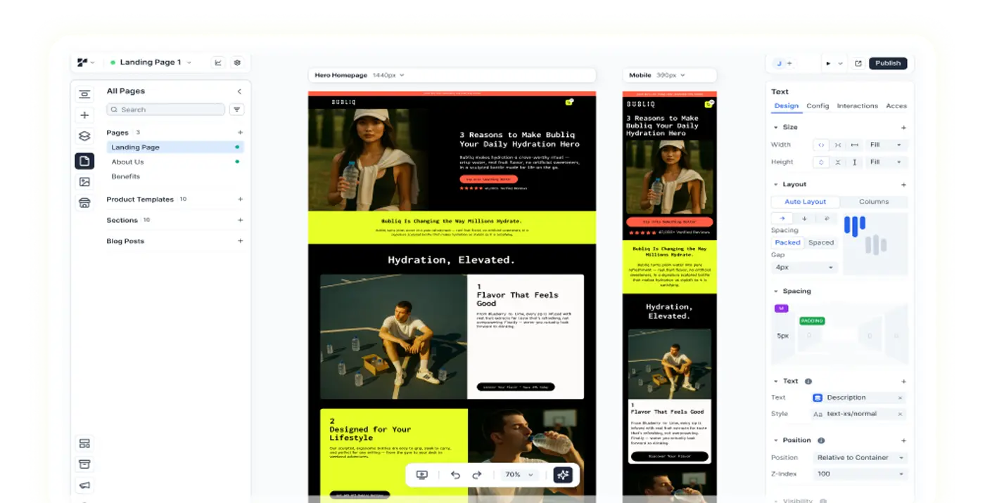
The goal is to give back the authority to the client, something Replo was able to achieve with Nathan James. The platform works to take the stigma out of website development so that someone doesn't have to be an expert in coding to create a page which aligns with their brand vision. Instead, Replo enables anyone to be able to build engaging and highly customizable landing pages without a single line of code; the drag and drop editor comes with a number of pre-built components, sections, and templates that allow the team at Nathan James to build landing pages faster than ever.
Something that Lauren says is, “Replo has allowed me to be a lot more hands-on with our website and to have control of the way that our brand looks on our website and to have control of the way that our brand looks on our website.”

The Result: The Day-To-Day Is All About The Customer
If we could sum up the top priorities of Nathan James we’d have to go with an emphasis on great customer service practices and belief in their products. Something that Lauren says sets them apart from other brands. This further reminds us of a brand’s relationship with the customer, not only in mitigating any problems but also utilizing the great feedback too.
Lauren details that this is a type of social proof because they do not have to only tell new customers about the great value of products, their returning customers can do that! Customer reviews are becoming quite popular in generating subsequent content.
Nathan James has used and talked about “adding reviews and user generated content, videos, images, as much as we can…so you can really see the product, you can know that other people have bought it, you can see what it looked like in their homes.” A decision that makes quite a lot of sense, for this industry, and beyond.
This attention to how people buy products online has set Nathan James apart from the rest. Their online shop is meant to be experiential and a pathway to interactive shopping. A shopping type we can all agree is only growing over time!
Lauren further illuminates the design process, much of which derives from inspiration. While she is focused on adding as much user generated content as possible, there is also a balance with “\[creating\] inspirational rooms and imagery for our customers so they can be inspired to see how to style something.”
As we continued, Lauren even gave us a design tip to think about! She tells us, “we have headboards that we’ll create room designs \[so\] you can use it in your dining room as a backrest for a little banquette seating nook.” So, their focus has been on making a shot by style group of collection pages making it easy to create a template and duplicate for all of their styles.
Lauren tells us that their start began with Amazon where customers first saw their products that were a more affordable option of something else that they were looking at.
The greatest appeal? Affordable pieces that look high end.
However now, much more of the buzz comes from word of mouth (again a reminder of the power of the customer review!). She says, “we have a lot of people on our social media that will tag their friends in our post, and then they can get that social proof on our website or wherever it might be of all their reviews that kind of back that up for us.”
Perhaps now as we’re also seeing a rise in attention to customer reviews, we’re in turn seeing how that’s now leveraged on social media. More and more brands are using social media to enhance their customer’s view of the product as it is in use even beyond the interactive shopping experience their website provides.
It’s About Inspiration Over Competition
Finally, what would be a successful site without a little inspiration? When asked which companies/brands does the Nathan James team look at, Lauren replied: CB2 and Article. Both are online furniture retailers that have similarly gained traction and buzz over the years.
The major inspiration being a current focus on furniture, so it makes complete sense to look at what works with other brands in the space. Furthermore, the draw to these sites is in the clean user interface and easy to find products.
This is where, as Lauren quips, it becomes “inspirational and beautiful. That always really inspires me and pushes me to make our site as beautiful and clean and user friendly as possible.”
{{get-started="/components"}}
Closing Thoughts: Improving Customer Experience For Your Brand With Replo
As a great brand example, Nathan James reminds us the customer should always be top of mind. They’ve explained how to transition into the D2C space, while leveraging reviews in new and exciting ways. Long gone is the time pacifying customers and not really asking their questions. Nathan James is taking a new approach, one that revolves around customer habits, needs, and experience.
With such an attention to experience, Nathan James can be as creative as they want when looking to continue to boost their overall interactive experience. As a partner, we love Nathan James’ approach to the process and aim to continue to deliver a truly experiential factor for their own use and ultimately to help the customer.
Replo is excited to work with brands like Nathan James to communicate their brand and landing page conversion rates. Building a high impact conversion funnel as efficiently as possible is both an art and a science, and the platform's mission is to equip users with the best tools possible.
Looking to try out Replo? Get started here or access a full product demo to learn more about the product! Join the Reploverse Slack community or follow Replo on X to stay updated on the latest.


Read More
Follow our curated courses to build custom solutions to scale your business.

Increasing Subscription Revenue by 20% in 7 Days for Really Good Boxed Wine

Increasing Conversion Rate For New Subscribing Customers By 6+% For Jibby Coffee

Growing Woxer’s Conversion Rate By 208% In 90 Days With Landing Page Conversion Funnels
Your full-stack growth engine
From small brands to scaling teams, sell anything on the Internet with Replo.


