Best Ecommerce Stores: Examples From Q3 2025
What you can learn from our top performing pages in Q3 2025, plus page building strategies and best practices that you should know.


Last updated: 2025-10-21
Takeaways
Page performance is usually measured by total conversion rate, though other metrics such as unique page views and total conversion value are common indicators.
Key tactics that all landing pages should be aware of include maintaining lightning fast load times, strengthening value props above the fold, adding social proof in context.
On top of that, you should make sure to give personalized merchandise recommendations, making your store mobile first, and adding concise and comprehensive product information.
Replo works with thousands of top ecommerce brands to build marketing funnels that convert.
Every quarter, we round up the top-performing landing pages in these funnels, as measured by their total CVR. Each of these pages average over 5000 total sessions across 30 days, with a total conversion rate of over 2%.
While the majority of these top performing pages tend to be product detail pages, or PDPs, every once in a while we get some exceptions, such as a product-forward homepage or a listicle.
Let’s see what these pages look like, and how you can replicate those same best practices and tactics in your pages.
How to calculate page performance for ecommerce stores?
There are many metrics for page performance in ecommerce, the most common ones being user sessions, unique page views, conversion rate (CVR), and conversion value. Each of these metrics will then have total or fractional attribution.
Total value attribution distributes each performance value equally across all user touchpoints between first touch and checkout. For example, if the conversion rate of a customer on the third landing page they visit is 3%, then 3% is also attributed to the first and second landing pages they land on.
On the other hand, fractional attribution divides each performance value equally across every touchpoint between first-touch and checkout. Following the same example, the 3% conversion rate would be divided by 3 for the number of touchpoints a customer had to land on before converting; therefore, fractional conversion rate is 1% per landing page.
{{get-started="/components"}}
Best Ecommerce Store Examples That Drove Conversions In Q3 2025
As you go through these stores, note how each example highlights product value or promise, reduces user friction, and builds viewer trust. Their call-to-action is more often than not singular, and always crystal clear.
And, they do all this without info-dumping on the viewer or cluttering the page.
Thrive Causemetics : Brilliant Eye Brightener Product Detail Page

From a conversion rate optimization (CRO) standpoint, this page applies several top-tier tactics.
The most powerful is anchored visual hierarchy: the “Add to Bag” button is repeated and always visible near decision points, ensuring there’s no cognitive friction when a user is ready to convert.
The product shade selector and model comparison grid use micro-interaction design, allowing shoppers to preview shades instantly — this reduces hesitation and decision fatigue.
Benefit-focused copy (“100% cruelty-free,” “98% naturally derived ingredients”) is paired with microbadges and icons that catch the eye before the user reads any text.
The landing page uses layered social proof: video testimonials, influencer quotes, and customer Q&As all appear before and after the purchase section.
The FAQ section at the bottom acts as a conversion safety net, answering last-minute objections about texture, longevity, and skin type suitability.
Even the long scroll design is deliberate—it keeps users engaged longer by progressively revealing new persuasive elements instead of front-loading all the information.
{{store-1="/components"}}
Takeaways To Get Inspired By For Your Next Page Build :
Start with above-the-fold visuals that clearly show your product in action, ideally across diverse use cases or user types.
Add a sticky or repeated CTA (“Add to Cart” or “Buy Now”) so visitors never have to scroll back up to convert. Use comparison visuals, such as swatches, size references, or lifestyle photos, to reduce uncertainty.
Layer your social proof throughout the page, not just in one block: integrate a testimonial carousel, star ratings near the title, and video reviews further down.
Don’t neglect conversion copywriting; use concise, benefit-driven phrases like “Clinically tested,” “Vegan & cruelty-free,” or “Lasts 12+ hours” near CTAs.
Finally, add an FAQ section to resolve objections and highlight your product guarantees, and ensure your checkout elements (payment icons, trust badges) are visible near purchase prompts.
RYZE Superfood: Mushroom Coffee Landing Page

This RYZE Mushroom Coffee landing page is high converting because it perfectly balances education, emotional appeal, and social proof; all while guiding visitors toward a single, clear call to action.
First, it leverages the “Hero-to-CTA loop”: the same “Try RYZE Today” button appears at multiple scroll points, ensuring users are never far from conversion.
The trust stack is robust: 200K+ five-star reviews, verified buyer badges, and a visible satisfaction guarantee all act as credibility boosters.
The benefit bar at the top (“Sharp Focus,” “Gut Health,” “Happiness Booster”) anchors visitors’ attention immediately, using iconography to make benefits visually memorable.
Further down, micro-education blocks — like the mushroom ingredient cards with one-sentence benefit blurbs — simplify complex product info into skimmable proof points, building authority while maintaining flow.
The FAQ section functions as an objection-handler, addressing common fears (e.g., caffeine levels, sweetness, safety in pregnancy).
Finally, the email signup at the bottom (“Join the RYZE Club”) extends conversion beyond purchase, using a soft opt-in for future re-engagement. Every element has been strategically placed to either reduce friction, build trust, or reinforce benefits.
{{store-2="/components"}}
Takeaways To Get Inspired By For Your Next Page Build :
Design their page around a single core promise that immediately tells visitors what they gain.
Use a hero image that visually supports your offer (e.g., lifestyle scenes or product-in-use) and pair it with a prominent sale or urgency badge (“25% OFF Today,” “Limited Edition Flavor”).
Repeat your CTA consistently throughout the page, especially after benefit sections, testimonials, and ingredient breakdowns.
Add a visual benefits bar near the top with icons representing your product’s key selling points — these create instant cognitive associations. Include trust markers like verified reviews, user photos, and guarantees to ease hesitation.
If your product requires education (like a supplement, skincare item, or functional food), break down the science into mini visual sections with labeled ingredients or short one-line explanations.
End your page with a FAQ block to address purchase objections and a low-friction opt-in (newsletter, club, or quiz) to capture non-buyers.
Nutrition Geeks: Collagen Glow-Up Product Detail Page
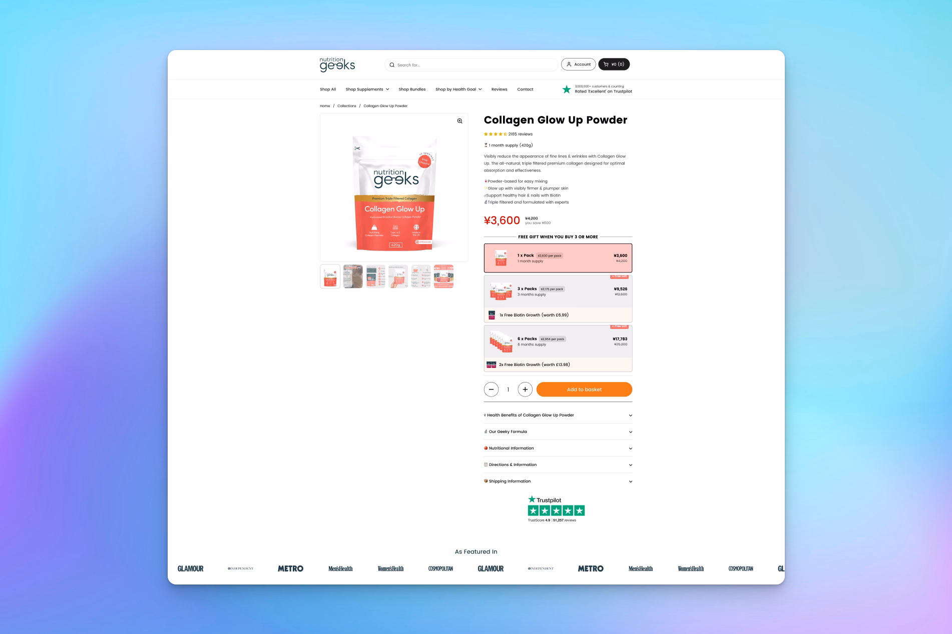
This page executes several precise tactics that guide users toward purchase without overwhelming them.
The anchored pricing structure shows the discounted rate next to the original price, visually reinforcing savings.
The orange “Add to Basket” CTA stands out sharply against the clean white background, ensuring it’s the visual focal point of the top section. The inclusion of a comparison chart (Collagen Glow Up vs Other Brands) below the fold is a masterstroke in objection handling — it frames the brand as the superior choice without forcing users to research elsewhere.
The accordion-style dropdowns for “Gut Friendly Formula,” “Nutritional Information,” and “Shipping Information” condense complexity into bite-sized sections, keeping the page clean and scannable.
Midway, the Trustpilot badge and customer star ratings serve as ongoing reassurance anchors, while the FAQ section near the bottom tackles common objections like “Can I take too much collagen?” and “Is this suitable for vegans?” — preventing hesitation right before checkout. Each design element has a defined behavioral purpose: reassure, educate, and close.
{{store-3="/components"}}
Takeaways To Get Inspired By For Your Next Page Build :
Start by ensuring that your price, star rating, and primary CTA are visible above the fold — this gives shoppers all the key information instantly. Use visual trust cues like review platforms (Trustpilot, Yotpo, Google Reviews) and media mentions to validate quality and authority.
Add a side-by-side comparison chart showing your product’s benefits versus competitors — this subtly reframes your brand as the smarter, higher-quality choice without being pushy.
Simplify your copy into accordion-style sections to make technical or detailed content digestible, especially for supplements, cosmetics, or wellness products.
Introduce bundle offers or free gifts directly on the product page to lift order values, and always reinforce urgency with limited quantities or time-sensitive offers.
Finally, end your page with an FAQ section to neutralize objections and a “You May Also Like” carousel to keep users engaged even if they’re not ready to buy.
These specific, structured tactics turn a standard product page into a trust-driven, conversion-optimized experience that mirrors what makes this Nutrition Geeks example so effective.
Dog Is Human: Daily Multivitamin Product Detail Page

This Dog is Human “Daily Multivitamin” landing page is built on deliberate, high-performing elements.
The subscription toggle with a visible discount (“Save 10%”) creates an immediate incentive to choose a higher-value purchase.
Right below the hero, a row of icon-based assurances (“Human-Grade,” “Made in Vermont,” “Third Party Tested”) provides scannable proof points that answer unspoken objections before they even arise.
The “Five Core Benefits for Long-Term Health” section uses short, bold benefit headlines (Skin & Coat, Hip & Joint, Digestion, Immunity, Heart Health) paired with real pet imagery to make the results feel personal and visual.
The “Formulated and Praised by Leading Vets” segment builds authority through real vet endorsements with headshots, leveraging expert validation as a conversion trigger. Meanwhile, the social proof carousel near the bottom—featuring real dogs and owners sharing testimonials—adds authentic community reinforcement.
Every section transitions logically from what it is, to why it works, to who trusts it, and finally how to buy it, which keeps visitors emotionally engaged and cognitively convinced all the way through the scroll.
{{store-4="/components"}}
Takeaways To Get Inspired By For Your Next Page Build :
Focus on structuring their product pages with the same psychological flow and design hierarchy.
Start by using a clean hero section that displays the product, star ratings, key benefits, and price toggle all above the fold — this eliminates friction and encourages instant trust.
Integrate subscription or bundle savings toggles right beside your CTA to increase average order value and retention. Add a row of trust icons or badges immediately below the hero to validate quality (e.g., “Clinically Tested,” “Sustainably Made,” “Backed by Experts”).
In your mid-page content, use simple, benefit-driven sections with lifestyle photography that mirrors your customer’s emotional goals — in this case, showing happy, healthy dogs.
Include expert validation with real names and faces (vets, nutritionists, or founders) to add authority, followed by authentic social proof such as customer photos or UGC carousels.
End with FAQs addressing objections and a risk-free guarantee bar (“30-Day Guarantee + Free Shipping”) near the footer.
Pair Eyewear: Homepage

This is a rare case of a product focused homepage being used as a landing page that has achieved a successful conversion rate. The page uses several tactical elements effectively.
First, it applies guided selling through education. The “How to Pick Your Pair” section uses iconography and microcopy to teach the product journey in seconds, which is crucial for customizable products that might otherwise confuse buyers.
The visual hierarchy ensures the user’s eye moves from aspirational imagery (the hero) to functional explanation (the three-step process), and then to product discovery (“The Lens Lineup,” “Explore Our Collections”).
The page leverages personalization psychology by showcasing diverse models and frame types, helping visitors see themselves reflected in the brand. The sticky, high-contrast CTAs (“Shop Now,” “Build Your Pair”) reappear throughout the scroll, preventing drop-off.
The social proof integration—customer photos, real user stories, and the “Pair Eyewear Gives Back” section—builds emotional trust and aligns with values-driven consumers.
The “Sign Up for 10% Off” email capture near the footer strategically converts even non-buyers into future customers, optimizing lead capture without disrupting the experience.
{{store-5="/components"}}
Takeaways To Get Inspired By For Your Next Page Build :
For other pages, brands should design landing pages that combine visual storytelling, guided purchasing, and layered trust signals.
Start with a hero section that features a smiling person using the product and a clear, benefit-driven headline that communicates both function and emotion.
Use step-by-step visual guides (like “How to Pick Your Pair”) to simplify complex or customizable offerings; this is especially effective for fashion, skincare, or tech.
Ensure consistent CTA placement after every major content block so buyers never lose their path to purchase. Add close-up product visuals and lifestyle photography to blend technical quality with emotional connection.
Include social proof, such as customer photos, video testimonials, or real reviews, to reinforce authenticity. End your page with mission-driven content (like “Pair Eyewear Gives Back”) and a lead capture incentive (“Sign up for 10% off”) to convert lingering visitors.
Everyday Dose: Mushroom Coffee Product Detail Page

From a conversion rate optimization (CRO) standpoint, this page employs several smart, tactical strategies that directly increase conversions.
The anchored value framing at the top (“$25 Save 20%”) creates instant perceived savings and motivates faster action. The variant selector (for size or bundle) uses a clean, interactive layout that encourages upsells and increases average order value without adding friction.
The repeated CTA buttons (“Add to Cart,” “Get Your Dose”) appear at multiple scroll points, ensuring users never have to backtrack to purchase.
The comparison chart (“Us vs Them”) is a particularly effective CRO tool; it reframes Dose as the superior, smarter choice without making users research competitors.
The “Real Talk, Real Customers” section features short, scannable reviews with customer photos—authentic micro-testimonials that build trust faster than long reviews.
The mid-page benefit bar (“Boosts Energy,” “Gut Health,” “Manages Stress”) doubles as an emotional reinforcement tool, subtly reminding users of the product’s holistic advantages as they scroll.
Lastly, the “Happiness Guaranteed” section at the bottom acts as a risk-reversal tactic, reducing hesitation and closing the conversion loop with an offer of free returns and satisfaction guarantees.
{{store-6="/components"}}
Takeaways To Get Inspired By For Your Next Page Build :
Ecommerce brands should build pages that combine visual energy, emotional resonance, and structured reassurance.
Start with a vibrant hero section that uses bold, benefit-oriented copy (“Transform Your Mornings”) and an aspirational image that conveys your brand’s emotion or outcome. Use layered value framing—show a discount, original price, and savings together—and place your first CTA above the fold.
Add a comparison table that highlights your product’s unique benefits against generic competitors to reframe choice in your favor. Throughout the page, include benefit icons or sticky bars that summarize core results, keeping key selling points visible even during long scrolls.
Showcase real customer reviews and user-generated photos to provide authentic social proof, and place a guarantee statement near the final CTA to reduce purchase anxiety.
Finally, align your color palette with your product’s emotional tone: bright and uplifting for energy products, calm and neutral for wellness items.
How To Build A High-Converting Ecommerce Store
No two stores achieve high conversion rates in the same way; factors such as time of year, product sector, product pricing, and target demographic play a great role in shaping what makes a page convert.
Brands figure out what works for them through a process of periodic A/B testing.
Here’s what that process typically looks like:
- Develop a hypothesis on how changing an on-page or off-page element would impact a performance metric for your landing page. Examples include bounce rate, conversion rates, and average order value. There should be a clear cause and effect between the element you edit and the expected result in your hypothesis; your result should be quantifiable and measurable.
- Create a variant landing page, featuring the edited version of a specific on-page element in your hypothesis.
- Publish the variant page and drive an equal amount of randomized split traffic (from the same advertisement or organic source) between the new variant landing page and the original page.
- Run the experiment for at least 2 business cycles, or at least 2 business weeks, and gather analytics on both pages. Make sure your results have reached statistical significance before you end an experiment.
- Based on the results of your A/B test, select the winning variant and publish that change as the new official version of your landing page. Repeat the A/B testing process with a different element on this new landing page, until you’ve tested every single element.
Check out this full guide on how to run an A/B test. Or, read our blog on A/B testing examples you can launch in minutes.
This process of A/B testing means that stores can methodically and scientifically determine how to improve their ecommerce page performance. They have a record of what works, what doesn’t, and what needs to be tested more.
It’s important to note that A/B testing is not a one-off thing. As mentioned before, many elements shape the performance of a landing page. These elements are in constant flux, such as your target audience or your product offerings, and as these things change, so do the impact of specific on-page edits.
While brands may have a go-to “master” landing page or product detail page format set up after several rounds of A/B testing, it’s important to pressure-test that format at least once every half year.
This allows you to catch any areas of improvement that need to be made. Even if a specific landing page format worked as the top performer in 2020, that may not hold true in 2025 anymore.
Periodic A/B testing ensures you aren’t leaving money on the table.
You should think of this cycle of periodic A/B testing as the larger strategy framework in which you optimize your pages for a specific performance metric.
In most cases, that metric would be total conversion rate, though other metrics such as user sessions, unique page views, total conversion value, or average order value are worth considering as well.
There are many tactics that you can A/B test towards achieving a brand’s performance goal.
Read the next section to learn more about which tactics and best practices we’ve seen succeed for our top customers.
{{get-started="/components"}}
Top Tactics For A High-Converting Ecommerce Store
The best ecommerce stores convert by removing friction, building trust, and making buying the obvious next step.
On top of that, a strong emphasis on content clarity, page speed, and mobile-first execution create the ideal user experience.
We’ve worked with thousands of ecommerce stores. Here is a full list of the market-proven tactics we’ve seen drive conversions for our customers time and again.
Check out each section for actionable edits you can make in your store today.
Lightning-Fast Load Time
Page speed plays a huge role on whether a viewer even stays on the page.
According to Hubspot, an ecommerce store that loads in one second has 2.5 times the conversion rates of a page that takes 5 seconds to load. On top of that, studies have shown that the slower a site is, the more people who bounce from a page after one second.
Finally, Google has explicitly stated that page speed plays a role in determining your page rank for a relevant keyword term across both desktop and mobile devices.
In other words, if you want to boost conversions, retain users, and increase SEO rankings, then you’ll want to prioritize your landing page speeds.
Page speed is measured using Core Web Vitals, which quantifies the three things that matter most to shoppers: loading, responsiveness, and visual stability.
Key benchmarks include First Contentful Paint, Largest Contentful Paint, Interaction to Next Paint, and Cumulative Layout Shift. For more explanation on these benchmarks, plus additional tactics on how to improve your page speed, check out our complete guide.
Here are a few summary items you should look out for:
- Oversized images are often the number one drag on performance. Compress all images to an WEBP format if possible, especially for above-the-fold images.
- Preloading is ideal for the hero image and the primary text font for headlines used above the fold, as it is the first thing viewers see. This will shorten the LCP for your pages.
- Lazy-load images below the fold; lazy loading delays non-critical images and embeds until they’re near the viewport.
- Trim unused scripts and defer non-critical JavaScript. Prioritize assets that make the page usable first. Push the rest after first paint or on interaction.
- Cache aggressively and use a Content Delivery Network (CDN).
Replo makes it easy for you to enable all of the above fixes. Plus, all pages built in Replo are pre-cached and pre-generated on our edge network (unlike traditional ecommerce store builders such as Shopify), with server-side rendering.
This means stores can ship less JavaScript and cut TTFB.
As you make the above fixes, be sure to measure the results. PageSpeed Insights is a great free tool that provides both lab analysis info and real-life user data.
On top of that page speed metrics tend to fluctuate over time (and not necessarily due to any specific page issues), so you’ll want to keep track of performance over time. As long as your metrics are within a certain threshold, performance should be decent.
In head-to-head tests (e.g., Brandefy and Nivie look-alike page builds versus original brand pages), Replo pages consistently scored ~20 points higher in PageSpeed Insights week over week over a 60 day period.
Value Prop Above The Fold
The average time spent on any given webpage across industries is 54 seconds.
That’s barely any time at all.
That means the first thing that viewers see on your site has a huge impact on whether they decide to continue browsing.
The headline in your hero section is what makes or breaks this first impression.
As a result, you want headlines that are concise and benefit-oriented, and that can clearly communicate the value proposition, or the key benefit, of your product.
You can do this by including measurable data and a brief mention of what exactly your product does in the headline.
For example, if you were a microwaveable cookware brand creating a landing page for your newest product, you might put “cook dinner for 4 in 5 minutes” as the headline, instead of “make microwave magic.”
While you’re focused on highlighting the value of your product, make sure to also call out the actual product itself. This saves viewers the effort of having to scroll down or scan through the images on the page to get a better idea of the actual product.
For example, if you were a bedding brand that sells quality bedding in custom colors, then your headline should be “bedding to dream in full color,” instead of just “dream in full color.”
In summary, here are the action items you should look out for:
- Write an engaging headline that highlights the value and benefit of your product. Showcase your brand character, but NOT at the cost of clarity. Don’t confuse your reader.
- Mention what your product does directly, so readers know what you’re selling from the get-go.
- Include measurable data on the results of your product, if applicable.
- Be concise; general best practice for writing meta tag titles caps word count at 50–60 characters. We recommend sticking to less than 50. Not only does it prevent truncation in Google results, it’s also easier and faster for people to read.
Social Proof In Context
When it comes to ecommerce, trust is everything. No one buys anything online without consulting a third-party opinion or reference anymore.
Best practices tells us that brands should always place any social proof they have near the decision point, so prospects can get reassurance exactly when questions surface.
Star rankings, product reviews, customer testimonials, and product mentions from reputable sources (such as newspapers, magazines, shows, or even certifications and awards) all help grow brand trust.
Other popular and highly impactful forms of social proof include user-generated content in video format. This can be paid or unpaid content, but both work wonders for better engaging your viewers and building trust in the brand.
The more you have, the better. And if you have any at all, make sure to feature it!
Here are some actionable tips on how to best feature social proof on the page:
- Use short, skimmable quotes tied to specific outcomes for testimonials or product mentions.
- Mix text reviews with UGC videos to boost credibility. These can be featured in a carousel format that’s easy for users to view and hard to miss.
- Repeat social proof points across the page as needed for more reinforcement. For example, you can feature your 4.7 star rating at the very top of the page, above the fold, then have another full-width banner featuring the same information lower down after the product description.
- Give new or existing users incentives to leave reviews or create UGC for your brand by offering limited edition gifts, or online store credit for their next purchase in exchange.
In many cases, just having a name or face attached to a brand can greatly increase a viewers’ sense of familiarity—and by extension—their willingness to buy, as well as buy more per purchase.
As a brand, store owners should always be aware of ways to integrate that into each customer touchpoint.
Personalized Merchandising
Recommendations should feel helpful, not random—and they should be strategically placed across your page to maximize customer engagement.
To create targeted merchandising content on a user, start by targeting their recent browsing behavior, as well as your best-selling items per category.
Replo’s integrations allow you to set up smart collections or recommendation sections using any third-party app of your choice. Or, you can create curated landing pages for each audience segment; each LP will then feature product recommendation sections that are unique to that target segment.
In both cases, your brand will be able to recommend products related to the current product-of-interest, and which also overlap with that target segment’s other potential interests.
One key tactic to note: rather than jumping into “recommended or related products” sections halfway down the landing page, try to keep the upselling near the bottom of the product landing page, or during check out.
It’s much easier to get a successful upsell or cross-sell once the brand already has one foot in the door.
Bundle builders are a great way to get people engaged with customizing their own product package while buying more at the same time.
Offer gamified incentives for added benefits or discounts such as free shipping or free product samples for orders above a certain threshold. For example, you can offer free shipping for every order above $35.
Replo enables you to create custom bundles in-app within minutes; either using components in our Theme Builder, or using chat in our AI Builder.
Offering subscriptions also allow brands to cultivate a recurring customer base and make buying even easier for users. This works especially well for consumable products, such as skincare items or catfood.
Many times, a custom bundle can be made into a custom subscription order that is set on repeat on a monthly or bimonthly basis.
Given enough subscribers, this means higher customer lifetime value, and lower customer acquisition costs, in the long run.
Quick tips for personalized merchandising include:
- Keep recommended products sections lightweight and relevant. Don’t bog down the viewer with unnecessary or irrelevant information.
- Don’t just settle on one variation of content! A/B test the order and combination of products featured to see which arrangement of items leads to the highest add-to-cart rate or average order value.
- Bundle builders are a great way for boosting AOV and for adding a level of customization to each customer’s order. Progress bars help visualize the level of added benefits that a user has unlocked or is close to unlocking.
Frictionless Mobile Experience
Most browsing—and a growing share of buying—happens on phones. As of 2025, mobile devices generate over 60% of page views worldwide.
All major brands have adapted to this, and in fact, many even design mobile first, before tailoring their pages to desktop or tablet.
This means adjusting font sizes and spacing for better readability on smaller screens, plus optimized video and images for mobile devices.
Replo’s device responsive app makes it easy for store owners to translate a mobile-first design across devices.
AI Builder defaults to generating all landing pages to be mobile friendly, while the modifier function allows you to make direct edits as needed.
Theme Builder lets you view desktop, mobile, and tablet device frames at the same time in the editor with multi-device editing. This means you can immediately see how all of the changes made in the desktop frame propagate across the other two devices.
While designing your store pages, here’s a few pointers to keep in mind:
- All buttons on mobile should be full width and centered; this makes it easy to reach and tap with one thumb.
- Make sure your font size is big enough, but not weirdly spaced or cut off.
- Double check your above the fold section is not cut off, incorrectly displayed, or abnormally long while on mobile. This is the first thing viewers see, you want the visuals here to be as optimized as possible.
- Place sticky CTAs on mobile to minimize scroll fatigue. This holds especially true for “add-to-cart” and “checkout.”
- Support one-tap wallets (such as Apple Pay, Google Wallet), guest checkout, and address autocomplete. Users do not like inputting payment information on their phones! It’s just a hassle—if there’s a way to simplify that process, do it.
If you had to prioritize designing for one device for your store, we would choose mobile over desktop or tablet.
Concise And Comprehensive Product Information
Shoppers want to know what they are getting, before they commit to a purchase. You should make that information as readily accessible and easy to find as possible—without overwhelming the reader.
That means disclosing information in an organized and readable format. Accordion dropdowns are usually the most helpful for categorizing and displaying that information.
As a result, when giving product information, always try to place it as high up on the product landing page (or PDP) as possible, so viewers see it early. This reassures shoppers and makes it easy for them to decide whether to buy.
Information to feature includes: what it’s made of, what items are included (for bundles), how to take care of it, and how to use it.
Other key actionable items include:
- Use progressive disclosure for product specs and fit information.
- Adding a Frequently Asked Questions section is also very helpful for pre-emptively responding to any potential concerns.
- Reveal shipping costs and delivery windows before checkout.
- Including information on any additional fees early on. No one likes to see a hidden add-on fee that is not clear until checkout; make sure to avoid that with your customers!
- If necessary, try including a grid format for competitor product comparisons. This makes it clear to viewers how your brand stands out among others and helps them with the decision making process
{{get-started="/components"}}
With all of the above tactics and our recommended A/B testing framework, you can make meaningful edits to your landing pages, without a full rebuild.
If you’re unsure where to start, try making a variant page with one change to a specific element (select any listed tactic from the sections above!) and then running an A/B test between the control and the variant. An example would be adding in an FAQ accordion section under the product buy box.
Run the A/B test, see how the two pages perform for your given performance metric, choose the winner, and make further single adjustments from there!
Unless you are already experienced with A/B testing, we would not recommend making multiple changes at once (also known as multivariate testing), as this makes it more difficult for brands to establish clearer causation on which element change leads to what result.
Remember, A/B testing is a constant and periodic process of continuous improvement.
As you work your way through the tactics in this blog, make sure to experiment with each and adjust them to fit the unique context of your brand, including your target audience, time of year, product type… etc.
For more guidance, check out our blog on ecommerce landing page best practices.
If you want to operate alongside the best ecommerce stores, the next move is simple. Start building, testing, and measuring pages that convert without waiting on a dev queue—create your account now.
FAQs About Building The Best Ecommerce Stores
How should I track if these changes improve landing page performance?
Key metrics to keep track of include total conversion rate, total conversion value, total unique pageviews, or average order value. Total CVR is the most common metric.
Replo offers our own in-house Analytics & Insights tool to track key metrics by page, store insights, and industry benchmarks for all users. You can also leverage our direct integration with Google Analytics, TripleWhale, and more.
Do I need a developer to implement these tactics?
No developers are needed for any of the above page-improvement tactics. Replo is optimized for the fastest page speeds on the market, and all content edits mentioned above can be generated quickly through chat or through direct edits made using modifiers.
Our app integrates directly with most tools in your ecommerce stack, so you can leverage any third-party tools you like.
What budget should I set aside for landing page optimization?
Landing page optimization does not require any significant budget. Many of these edits are free to make with any page builder tool, though Replo makes it especially quick and easy with our chat page generation function and in-app templates for users to get started fast.
Measuring and recording the direct impact of these edits while continually A/B testing is what ensures you can quantifiably optimize your store pages over time.
How fast should my pages load on mobile?
Target FCP ≤ 1.8 seconds (avoid going about 3s), LCP ≤ 2.5s (okay up to 4s), INP ≈ 200ms (acceptable ≤ 500ms), and CLS ≤ 0.1 (≤ 0.25 is borderline). Prioritize real-device tests over lab-only scores for the most accurate picture. For more information, check out this guide.
Your full-stack growth engine
From small brands to scaling teams, sell anything on the Internet with Replo.