How To Improve Landing Page Conversion Rate
The 10 things you need to do to improve landing page conversion rate for your store.
Last updated: 2026-01-08
Takeaways
Best practices for improving landing page conversion rate are centered on the clarity of information, the consistency of branding, and the engagement value of your call-to-action or content.
Actionable tactics include a strong headline, a clear and easily accessible CTA, strategically placed product sections, high-quality images, informative product descriptions, a powerful product guarantee, and plentiful social proof.
A/B testing is recommended for getting measurable results on how a landing page variant improves conversion rate.
Landing page conversion rate optimization is not easy. It requires consistent, iterative A/B testing and trial and error to figure out what works for your brand and product. Not only that, the end conversion rate results can vary widely according to product and industry, though a study by Hubspot in 2023 notes that the average across all industries hovers around 5.89%.
We analyzed all the top landing pages that leading DTC brands have built with us, and here's what we found on how you can improve conversion rates for your pages.
What Is A Landing Page Conversion Rate
In plain terms, it’s the percentage of visitors who complete a defined action on a single-purpose page. You pick the action, measure the completions of that action, and divide by traffic.
Unlike engagement metrics such as bounce rate or time on page, it measures the direct effectiveness of the page in generating action.
What is landing page conversion rate?
It’s the percentage of visitors who complete your single desired action on a landing page, such as a purchase or signup, divided by total visits during a period.
How To Calculate Landing Page Conversion Rate
Before diving into benchmarks, learning how to calculate your landing page conversion rate ensures the right baseline.
The math is simple: divide conversions by sessions, then multiply by 100. This formula applies to purchases, downloads, or form submissions alike.
Step 1 — Identify the goal action. You might track email signups, purchases, downloads, or booked calls. Make sure the action is crystal clear and measured once per visitor session.
Step 2 — Divide conversions by sessions. Sessions represent distinct visits, while page views can include reloads. For example, 50 signups from 1,000 sessions equals 0.05.
Step 3 — Multiply by 100 to get a percentage. In the example, 0.05 becomes 5%. That format lets you compare pages, channels, and time periods easily.
What Is a Good Conversion Rate for Landing Pages
“Good” depends on the offer, audience, product type, price point, and risk. For example, a $10,000 luxury item won’t convert like a newsletter. That’s expected.
On top of that, industry conversion rates can vary widely. Consumer packaged goods and beauty and wellness categories usually have the highest conversion rates, due to their lower price point and status as a consumable good. Meanwhile, home goods and luxury items usually have the lowest conversion rates, due to significantly higher price points and longer product life cycles.
For more detail on vertical-by-vertical context, take a look at our industry conversion benchmarks.
When in doubt, benchmark against your closest peers and your own recent period. Improve from there. You’ll avoid chasing vanity numbers and focus on profit.
One guardrail helps: a good landing page conversion rate generally sits around 3-5%, depending on the product and industry.
Here’s the general trends that we’ve seen across page types:
- Ecommerce pages average 3–5%, driven by product discovery friction.
- Lead generation pages average 7–10%, thanks to simpler value exchanges like free resources.
- SaaS free trial pages achieve 8–12%, where user intent is already strong.
- Webinar and event pages reach 10–15%, fueled by urgency and one-time offers.
Landing Page Best Practices To Grow CVR
Want to improve your landing page conversion rates? Here are 10 things you can start doing now.
1. Craft A Clear Headline
The average time spent on any given webpage across industries is 54 seconds.
That’s not a lot of time at all, which means that the first thing that viewers see on your site has a huge impact on whether they decide to continue browsing.
The headline in your hero section is what makes or breaks this first impression. As a result, you want headlines that are concise and benefit-oriented, and that can clearly communicate the value proposition, or the key benefit, of your product.
You can do this by including measurable data and a brief mention of what exactly your product does in the headline.
For example, if you were a microwaveable cookware brand creating a landing page for your newest product, you might put “cook dinner for 4 in 5 minutes” as the headline, instead of “make microwave magic.”
The former leaves no room for confusion—it delivers a definite end result, and tells you exactly how long it would take to achieve it. Meanwhile, the latter headline is neither measurable nor very clear on the exact benefit of your product.
While you’re focused on highlighting the value of your product, make sure to also call out the actual product itself. This saves viewers the effort of having to scroll down or scan through the images on the page to get a better idea of the actual product.
For example, if you were a bedding brand that sells quality bedding in custom colors, then your headline should be “bedding to dream in full color,” instead of just “dream in full color.”
Both versions provide a value proposition.
However, only the former makes it clear that you’re selling pillows and duvets, while the latter does not really specify what product you’re offering. In this case, the former headline is what communicates the value proposition and the actual product.
.avif)
2. Optimize Your CTA
Your CTA is the text that highlights the goal action you’d like your audiences to achieve. The goal action—also known as the conversion—can be defined as any action for that page, though most often it’s defined as a product purchase.
In your landing pages, you want to make sure your CTA button is prominent with contrasting colors, straightforward action-oriented language, and a very clear layout.
One way to do this includes making the CTA full-width on mobile, so it’s easier to click on and more difficult to miss.
For example, a full width CTA right under the hero section can be “Try For Free” in white against a pure black banner background. This CTA states the action, and very clearly stands out from the rest of the page.
.avif)
Another method includes putting the CTA on a button in the bottom right hand corner of the mobile screen (not the page!), so viewers with phones can more easily press the button with their thumbs (assuming they hold their phones in their right hand, as most people are right-handed).
If your CTA is overlaid on top of graphics or images, you also want to make sure that the text does not get buried among the background.
For example, don’t make the text white over a similarly shaded image, or don’t use a paler color against an already mixed-color background.
When it comes to designing a powerful CTA, you want it to look just as direct and straightforward as it reads.
If you’d like to make the CTA really pop, then placing the CTA text on a contrasting and uniformly colored shape as its own backdrop would be the most helpful.
3. Arrange Your Content Sections Strategically
Every single piece of messaging on your landing page should work towards highlighting the benefits of your product, or making it stupid easy for shoppers to find the information they need.
You can do this through the custom arrangement of your content sections or the type of messaging across your landing pages.
Here’s how:
- If you have a collections section, make sure to add benefits at the middle or top of the collections page.
- If you have a collections section, you should always add common searched terms as filter buttons that users can select at the top of the collections, or include a search bar.
- Rather than jumping into “recommended or related products” sections halfway down the landing page, try to keep the upselling to the very bottom of the product landing page, or during check out. It’s much easier to get a successful upsell or cross-sell once the brand already has one foot in the door. Bundle builders are a great way to get people engaged with customizing their own product package while buying more at the same time.
- Offer gamified incentives for added benefits or discounts such as free shipping or free product samples for orders above a certain threshold. For example, you can offer free shipping for every order above $55.
- Always give as much detailed product information as you can, as high up on the product landing page (or PDP) as possible, so viewers see it early. This reassures shoppers and makes it easy for them to decide whether to buy. Information to feature includes: what it’s made of, what items are included (for bundles), how to take care of it, and how to use it.
4. Design Your Content For Easy Viewing
Now that we’ve covered the textual content of your landing pages, let’s talk about the visual design.
As a rule of thumb, you want to make sure that your page is easy to navigate. Keep separate page sections or nav bars clear and relevant; make sure to remove any redundant content.
Your font should be clear and easy to read. This means high contrast, bigger font sizes, and prioritizing placing text in their own sections instead of overlaying them on a graphic or image.
If you have your text in buttons, make sure that the graphics don’t conflict with the button, or that the spacing is well adjusted to make the overall design of the landing page less cluttered.
For example, instead of a button with white borders and text and a transparent fill, you should give it a black fill.
For important messages that you want to highlight, don’t be afraid to make the text as large as needed to really stand out on the page.
Also keep an eye out on sentence length, as overly lengthy sentences can create a sluggish viewing experience and disincentivize shoppers from staying on the page.
When you have many sections within a landing page, and each section is discussing a different message, you should be very direct about the specific product you’re highlighting in each section.
A quick fix for this is just mentioning the name of the product you’re exploring for that section right in the header.
This helps viewers better understand your content in that section, and if they’re interested in a particular product, quickly find what they need on the page.
Sounds simple, we know, but you’d be surprised by how many brands forget to do this.
Finally, as you’re arranging your content section by section down the page, it would be helpful to keep the next section of content peeking just above the fold.
This gives audiences a brief preview to the content that’s coming next and incentivizes them to scroll down and read more.
5. Leverage Social Proof
Showcase customer testimonials, reviews, and social media mentions to build trust and credibility for your brand.
According to a 2023 survey from EnTribe, around 82% of consumers say that they would be more likely to buy from a brand that uses UGC in their marketing. In another survey, S&P Global noted that 62% of surveyed enterprises said increasing UGC was “highly important” for boosting brand authenticity.
For example, many product landing pages feature their star rankings at the top of the product buy box, right on top or under their product names, to signal how highly rated they are.
Or, they feature carousels of reviews or product mentions in reputable sources (such as newspapers, magazines, shows, or even awards) on their landing pages for added social proof.
.avif)
Other popular and highly impactful forms of social proof include user-generated content in video format. This can be paid or unpaid content, but both work wonders for better engaging your viewers and building trust in the brand.
In many cases, even just having a person' s name or face attached to a brand can greatly increase a viewers’ sense of familiarity—and by extension—their willingness to buy, as well as buy more per purchase.
6. Improve Page Load Speed
Your pages should load as fast as possible to keep users from bouncing away.
We’re not joking. According to Think With Google, if a mobile site takes longer than 3 seconds to load, over half of visitors will abandon it.
Here’s what you can do:
Compress images without losing their quality before uploading them onto your landing pages, for example by using WEBP or AVIF image formats.
Minimize the amount of custom code used in your landing pages; Replo helps you do exactly this—by enabling users to create unique custom page designs with zero code.
In fact, all landing pages built in Replo are optimized for speed, with image compression and lazy loading, so you don’t have to worry about losing clicks due to loading times.
Learn more about how we do it in our full guide on optimizing page loading speeds.
7. Ensure Mobile Responsiveness
Design your landing page to be fully responsive and accessible to users, no matter the device they are viewing your site from.
This means adjusting font sizes and spacing for better readability on smaller screens, plus optimized video and images for mobile devices. This gives your shoppers a more cohesive browsing experience and helps you maintain consistency across your brand.
All pages created in Replo Builder are automatically optimized for mobile, meaning users do not have to make any further changes between desktop and mobile versions.
If you’re using our Theme Builder, the editor lets you view desktop, mobile, and tablet device frames at the same time with multi-device editing. This means you can immediately see how all of the changes made in the desktop frame propagate across the other two devices.
Or, you can set custom dimensions to a specific pixel width if your preferred dimensions are not listed in our default device views.
8. Simplify Your Forms
Any forms or pop-ups in your landing pages should be short and concise, asking only for essential information to keep disruption of the users’ shopping experience to a minimum. Ideally you can keep form fields under 3; the fewer the better.
For example, if you have a lightbox asking viewers to sign up for your newsletter, then you should not ask for more information than what is necessary. In this case, only their name and email address would be required.
Pop-ups or forms that are too long can greatly increase the chances of users exiting the pop-up or abandoning the page, especially if there is little incentive for users to fill out that form to begin with.
A method of mediating this is by using a “micro-yes” pop-up that offers an incentive for users to fill out a form.
For example, a pop-up can ask viewers if they would like a 10% discount on their first order. If they select yes, then they are immediately led to a newsletter sign-up form, which only asks for their name and email.
The aforementioned discount code will then be emailed to them once they sign up.
This method not only keeps the form short and sweet, but it also motivates shoppers to sign up in the first place. In this way, the sign-up process is not a one-sided ask, but a mutual exchange.
The brand gets their leads, and the users get a positive welcome experience via a discount for their first purchase.
9. Use Unique High-Quality Visuals
No high-converting landing page would be complete without quality imagery.
This means high-resolution images and videos that are relevant to your offer and that showcase your product or service.
This is especially important for visuals in the hero section, as it is what viewers will associate with your brand or product first and foremost.
Plus, you should make sure to highlight your product in real life use-case scenarios, so shoppers can envision how that product fits into their lives.
For example, if you’re selling nice ceramic bowls, then don’t just show them in front of a photoshoot backdrop! Show them with food inside, or being washed in the sink, or stacked in someone’s kitchen cabinet.
Make the product feel real to your shoppers.
A unique way to engage your audience with visuals is to prominently feature quality user generated images or videos on the landing page.
This not only strengthens social proof, but also motivates customer participation and brand loyalty, especially if the top performing piece of content gets brand or social recognition for their work.
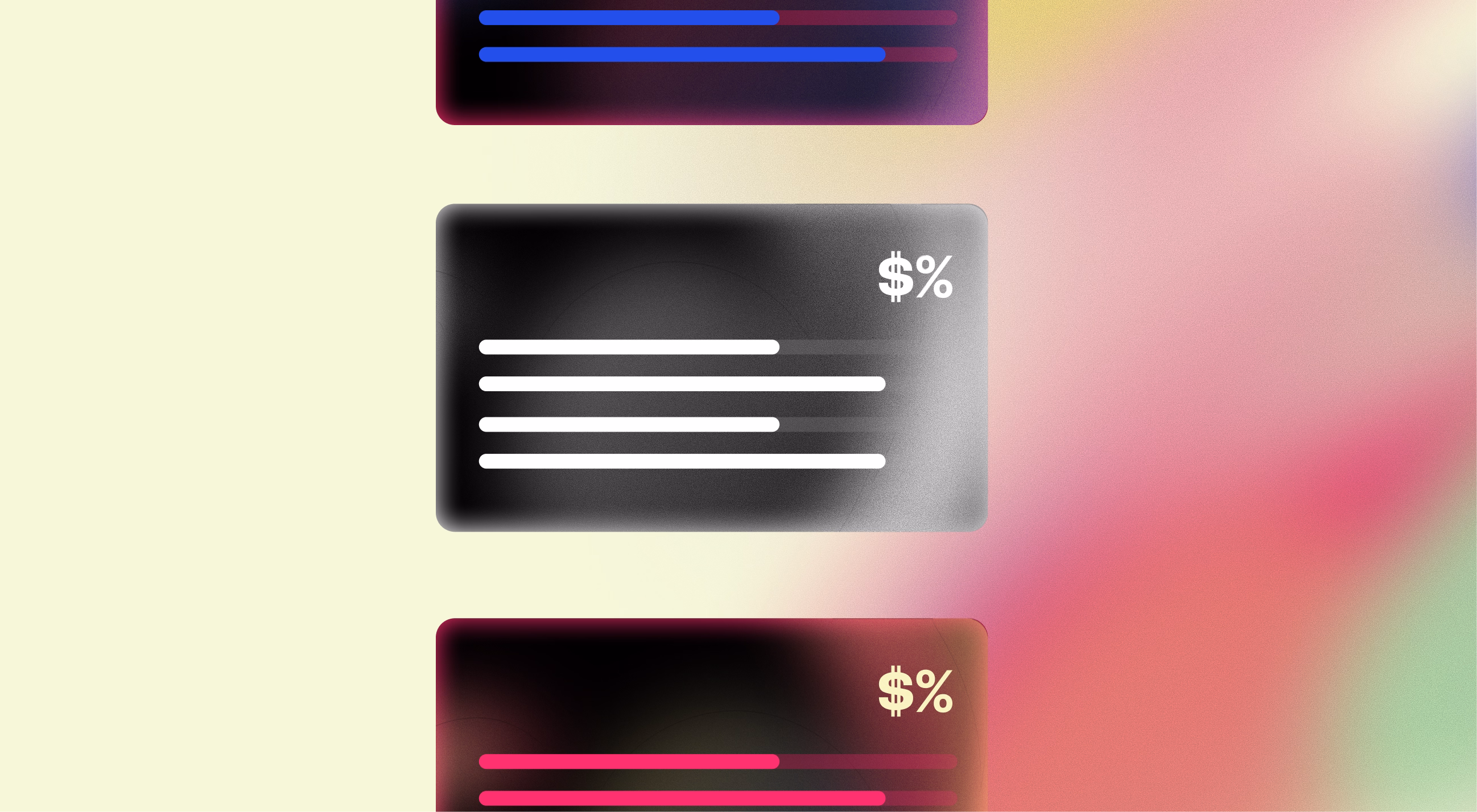
10. A/B Testing Different Landing Page Elements
The key is to periodically A/B test elements across your pages to get clear data on what’s actually working and what isn’t.
Otherwise, what works for one brand may not work for you.
The goal is to identify what version resonates best with your audience and drives the most conversions. Everything we just covered on how to increase landing page conversion rate can be A/B tested.
However, the most common elements to experiment with tend to be headlines, CTAs, images, and page layouts
.avif)
For headlines, this can include different messaging or typography. For CTAs, this can mean comparing “Get 10% Off Your First Order Now” to “Get Your Custom Styling Consultation.”
You can test different color themes for your images, or experiment with swapping the order of individual benefits sections on your landing pages, to see which leads to a great conversion rate.
.avif)
Visit our checklist on the 9 A/B test experiments you should run in your landing pages right now for more elements to test.
Get our full guide on how to A/B test your landing pages, no matter if you’re a beginner or advanced user.
Your Next Step to Improving CVR Today
Staying ahead of industry standards means building, testing, and benchmarking fast. Replo helps you achieve all three with our Builder, A/B testing, and Analytics tools.
To get started, simply give Replo chat a short prompt on what you want to build and what product you’re selling. Drop in a webpage URL to use as inspiration or as a direct reference if you have one. It’s that easy.
Sign up for free to start building, testing, and improving in minutes rather than weeks.
FAQs About Landing Page Conversions
What is the difference between a landing page rate and a website conversion rate?
A single landing page targets one action, while a full site enables many paths and goals. That focus typically raises the page’s conversion potential.
How many landing pages should my ecommerce brand have?
Create dedicated pages for your major campaigns, categories, and top traffic sources. More targeted pages usually mean better relevance, and as a result, higher revenue yield or performance metrics.
How long should I run a test before declaring a winner?
Run at least two weeks or two business cycles to reach solid volume, so randomness evens out. Ending tests early creates false positives and may not be statistically significant.
What’s the fastest way to improve results this quarter?
Ship a speed pass of your ad and product landing pages, trim down any unnecessary content, and align one message from ad to chckout. Then run a clean split test with one change in a key on-page element to start iterating for conversion lift. Repeat until you've reached a satisfactory benchmark.